
Têt-à-Têt: A Guide to Nurturing Vietnamese Roots Away from Home
Publication Design
Têt-à-Têt is a guide designed to help Vietnamese people reconnect with Têt’ traditions while living away from home. The project began from a personal place, thinking about distance, memory, and the fear of cultural erasure that can grow over time. It gathers rituals, foods, stories, and small gestures that shape the Lunar New Year, then translates them into a format that feels accessible and intimate. The visual language draws from familiar Vietnamese materials and colors, balancing nostalgia with clarity. Rather than presenting Têt’ as a fixed celebration, the project treats it as something living, something that can be carried, adapted, and passed on.
The Challenge
❋
The Challenge ❋
International students often receive information too early, too late, or spread across disconnected systems. Important tasks are missed not due to carelessness, but due to unclear timing and conflicting instructions. At the same time, students at very different points in their journey are usually treated the same, even though their concerns are not. This creates stress, confusion, and hesitation around asking for help, especially when the consequences feel high.
The Solution
❋
The Solution ❋
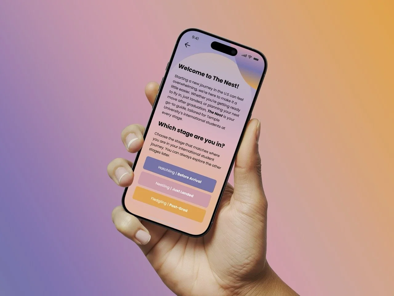
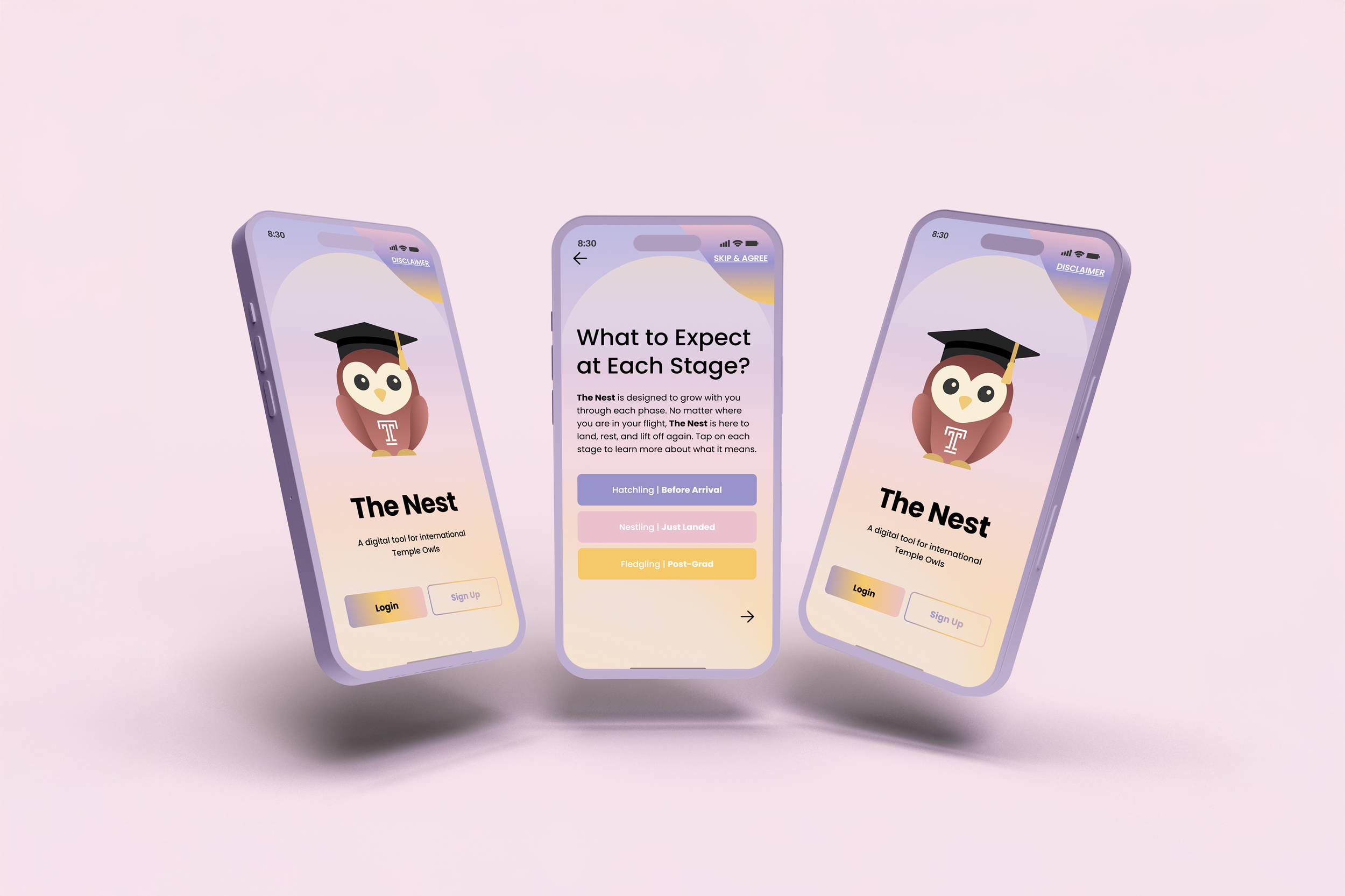
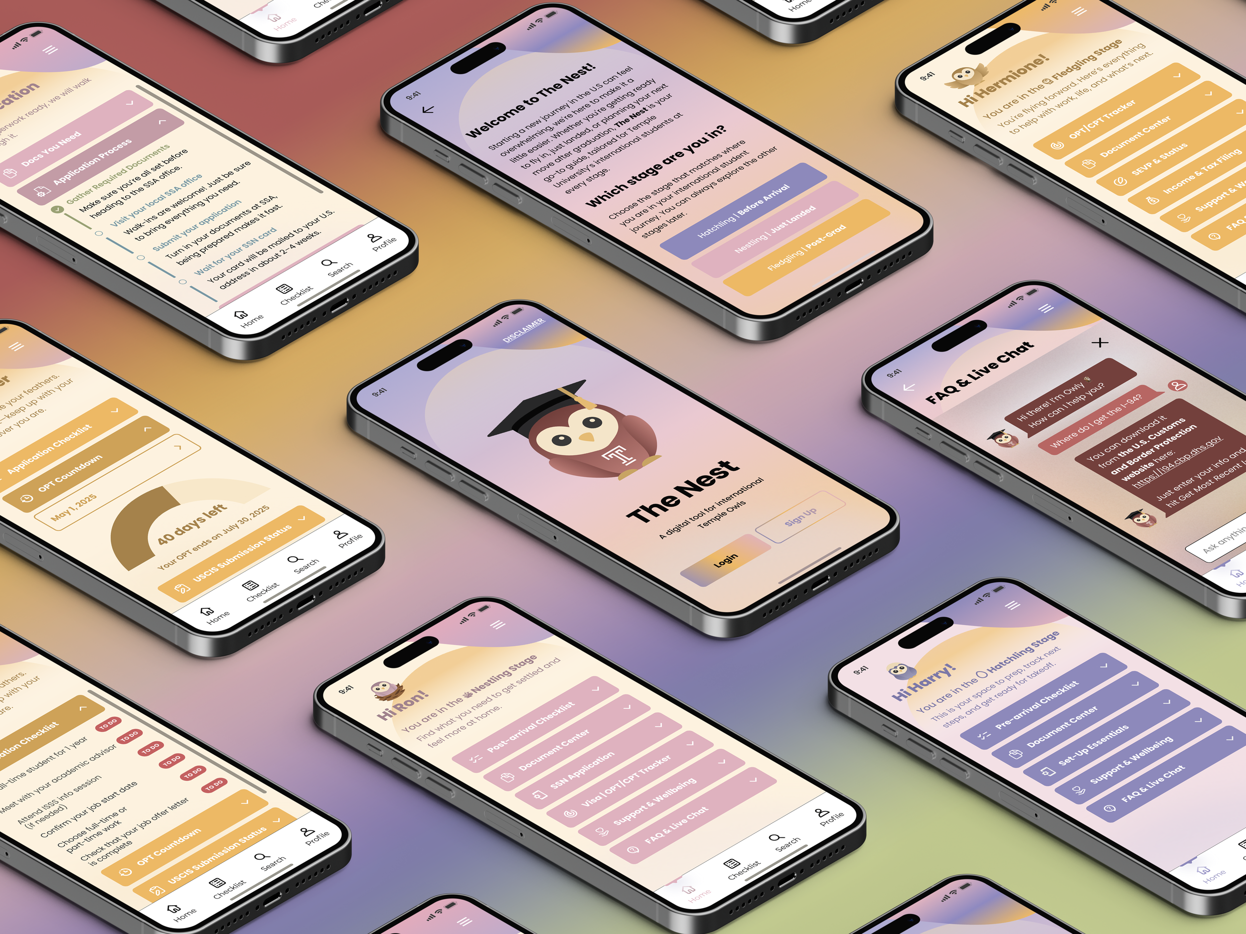
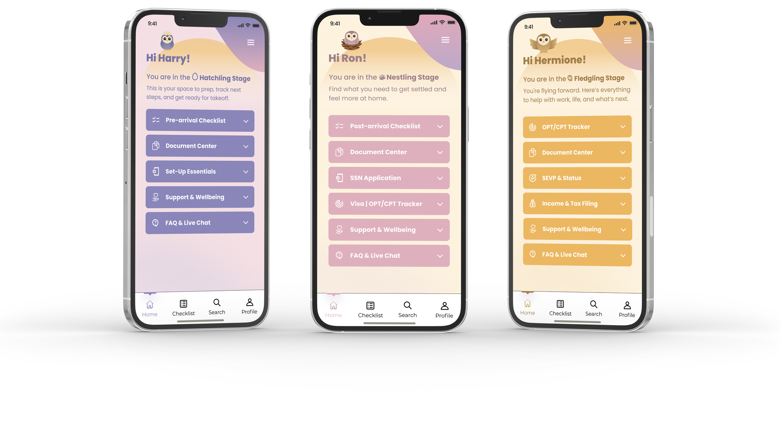
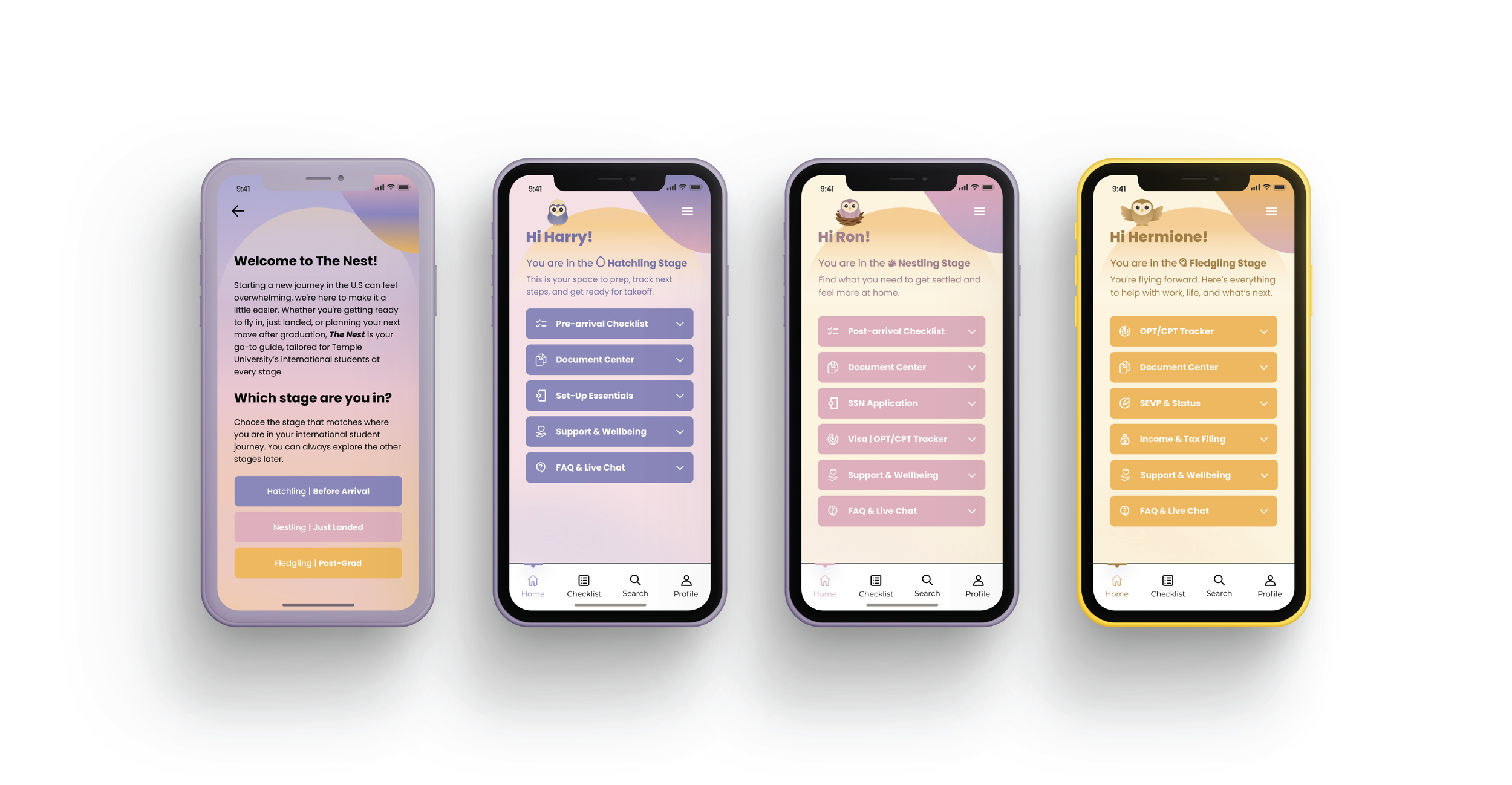
The Nest structures support around three stages: before arrival, just landed, and post-graduation. Each stage surfaces only the tools and information most relevant at that moment, reducing overload and making each visit feel purposeful. As students move forward, the app adapts with them, shifting from logistics and daily systems toward long-term planning and career support. This approach turns scattered information into guided steps that feel manageable and grounded.
The Research
❋
The Research ❋
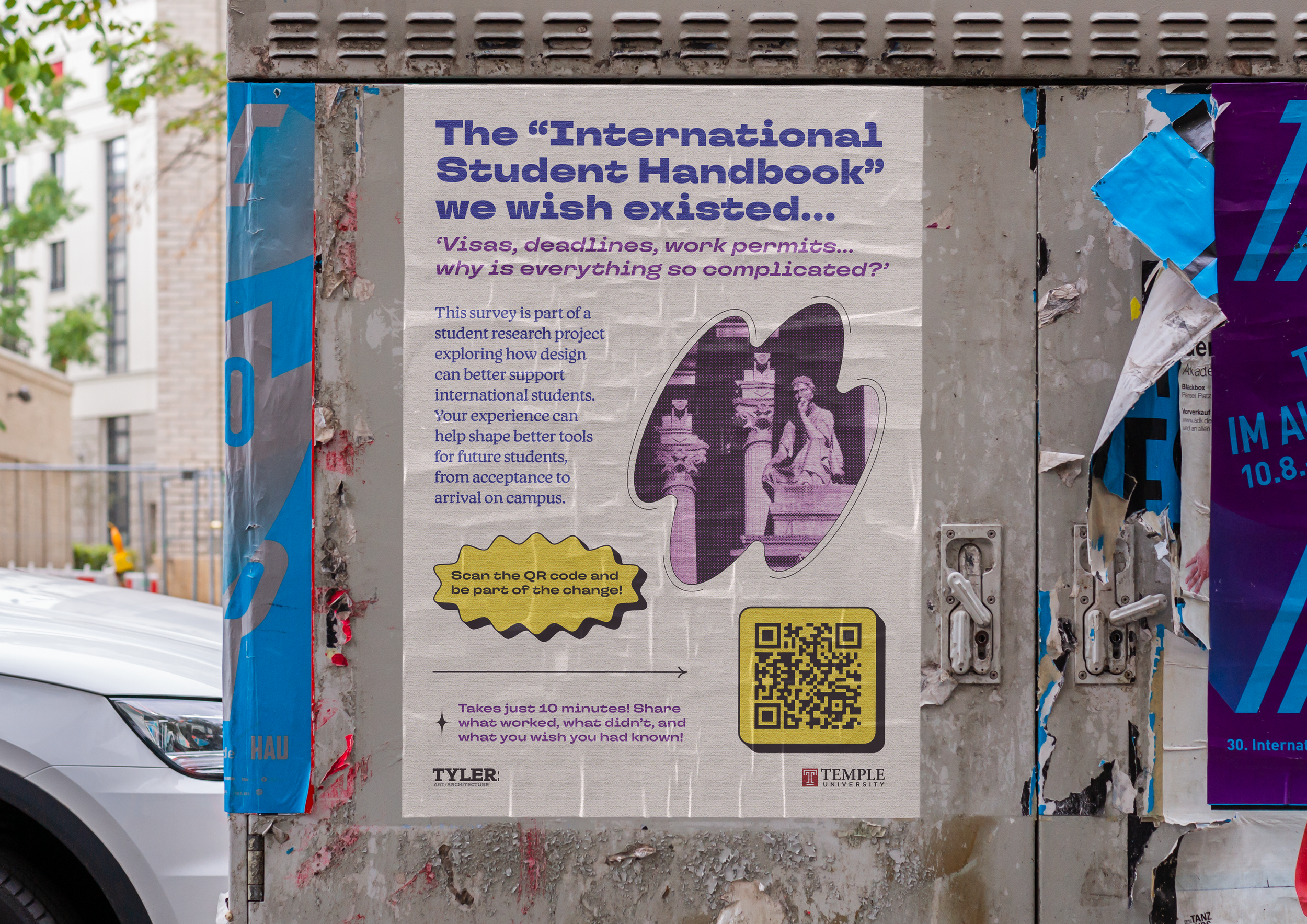
Research shaped both the structure and tone of the app. Surveys, interviews, and card sorting clarified how students understand their needs over time and how they mentally group information. These insights informed the stage model, the navigation system, and the decision to balance institutional resources with peer-driven knowledge.
-
I surveyed 56 international students across different academic levels and visa statuses. Responses consistently pointed to stress around unclear timelines, repeated paperwork, and uncertainty about where to go for reliable answers. Many students described relying on friends before official channels when instructions felt overwhelming or inconsistent. While Vietnam is overrepresented due to my social circles, many of the shared frustrations are common across countries and visa types.
-
Card sorting sessions revealed clear patterns in how students categorize information. Arrival logistics clustered together, daily life tasks formed another group, and career planning emerged as a separate concern tied to later stages. These patterns directly informed the app’s navigation and reinforced the value of a stage-based structure.
-
Students struggled with tracking progress across multiple systems, understanding when tasks actually mattered, and asking questions without fear of making mistakes. These challenges often led to delays, duplicated effort, and added stress during already demanding transitions.
-
The research showed that students were motivated and proactive, yet lacked clarity and reassurance. A system that acknowledges timing, emotional pressure, and shared experience feels more supportive than one that simply provides information. Guidance works best when it meets students where they are.
User Personas
❋
User Personas ❋
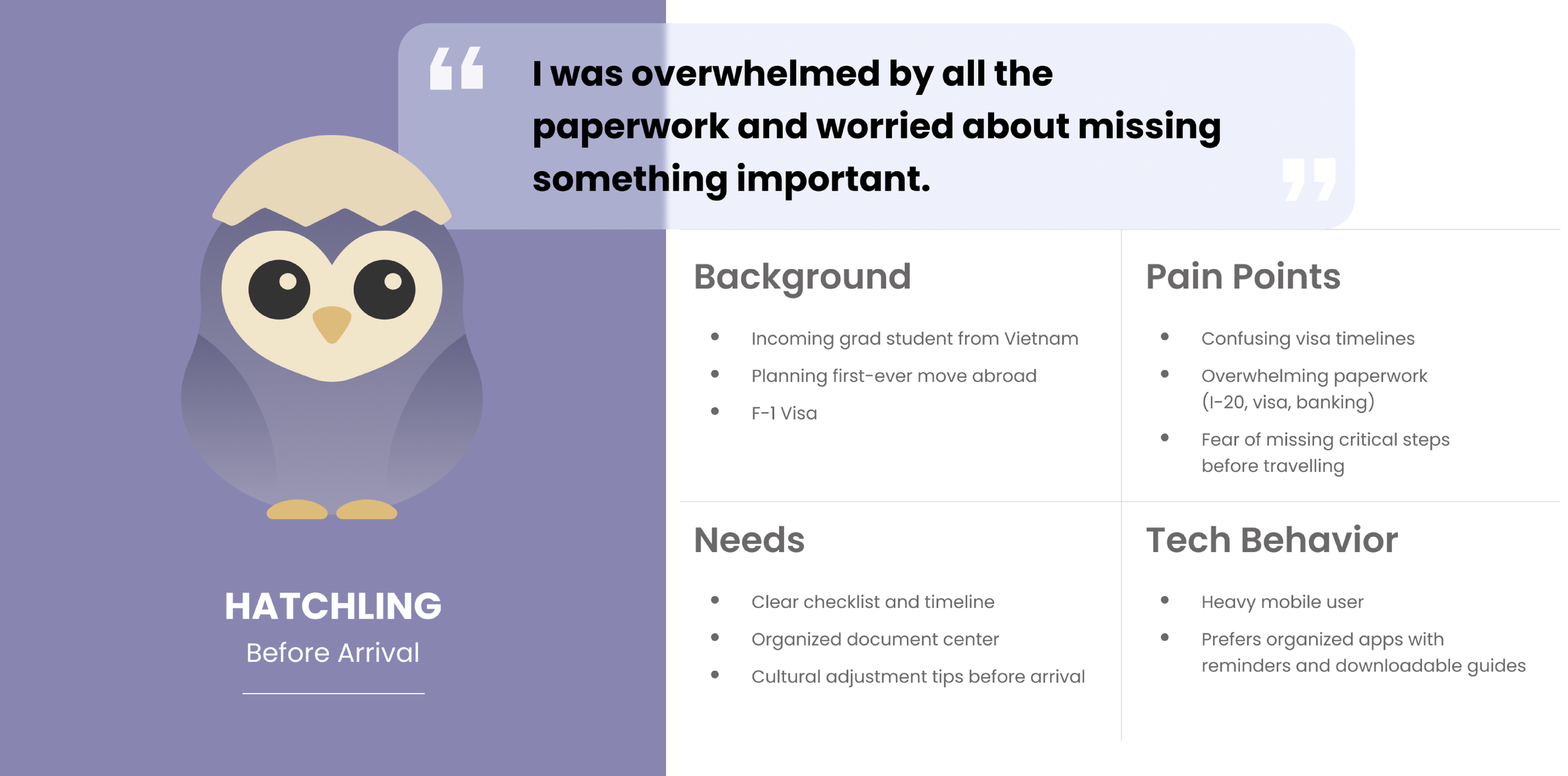

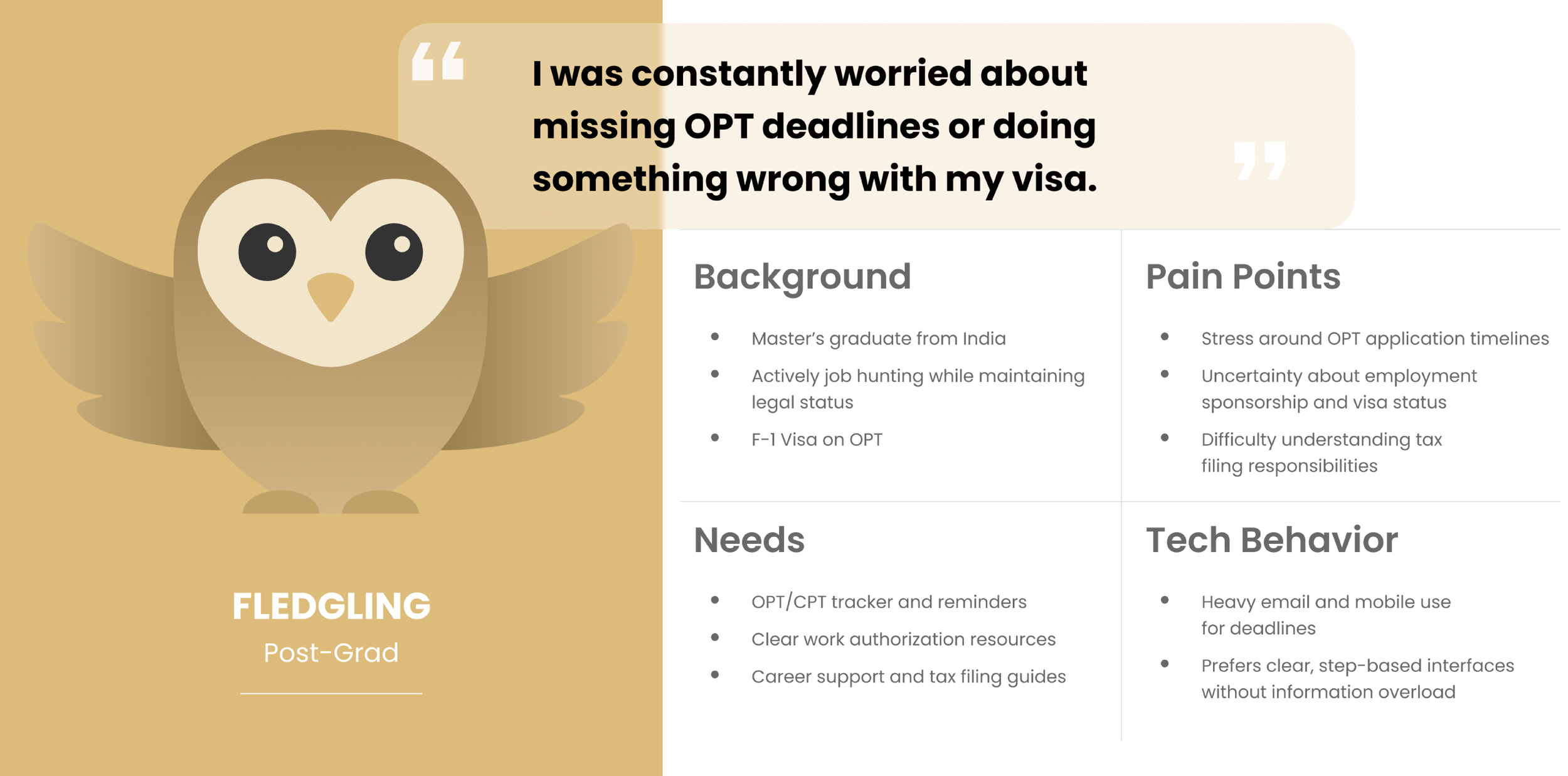
The research resulted in three personas aligned with each stage of the journey. Hatchling represents students preparing to arrive and focused on documentation and logistics. Nestling reflects newly arrived students navigating daily systems and campus life. Fledgling represents students approaching graduation and thinking about work authorization and long-term plans. These personas guided content prioritization, tone, and feature development throughout the project.
Design Process
❋
Design Process ❋
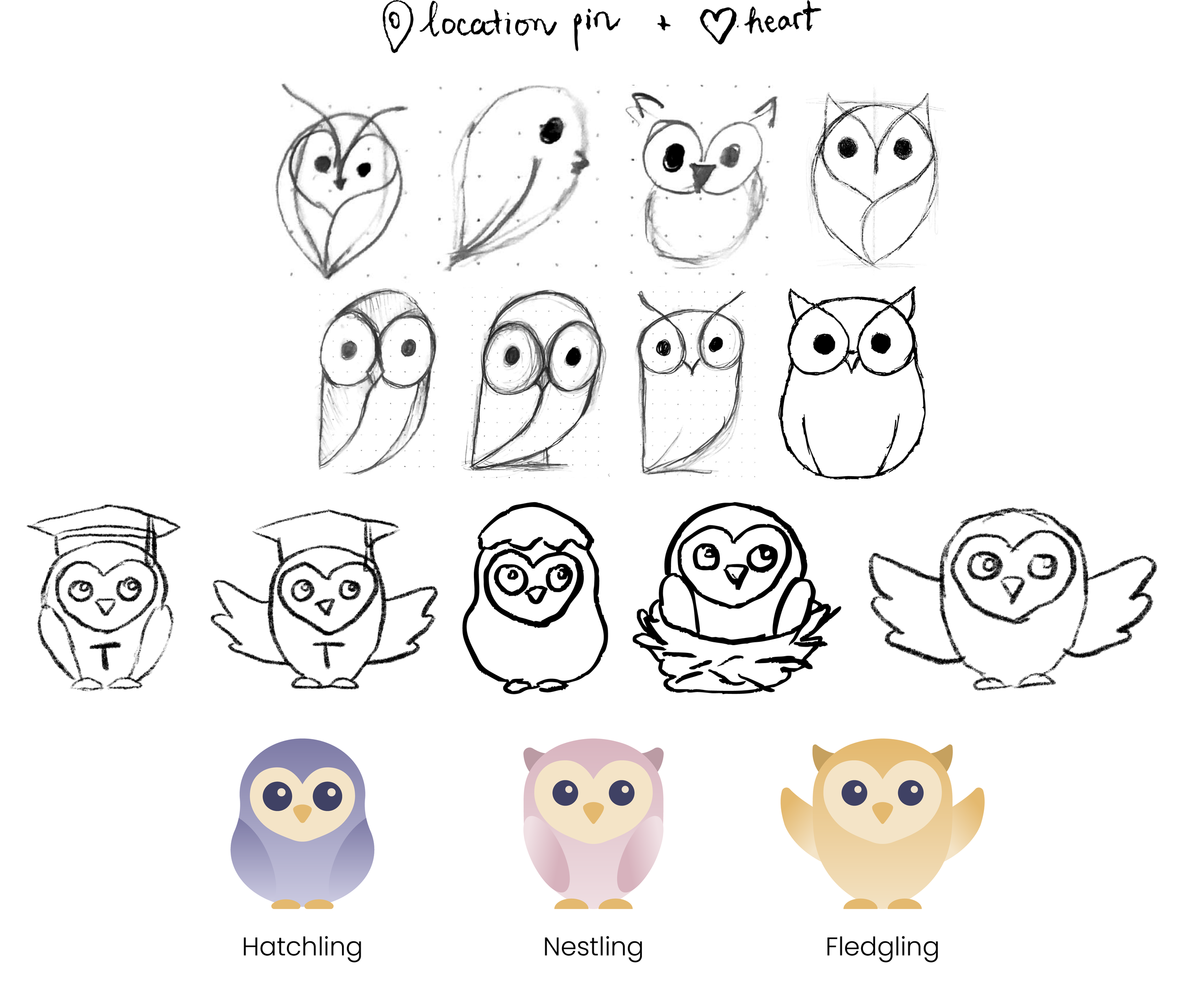
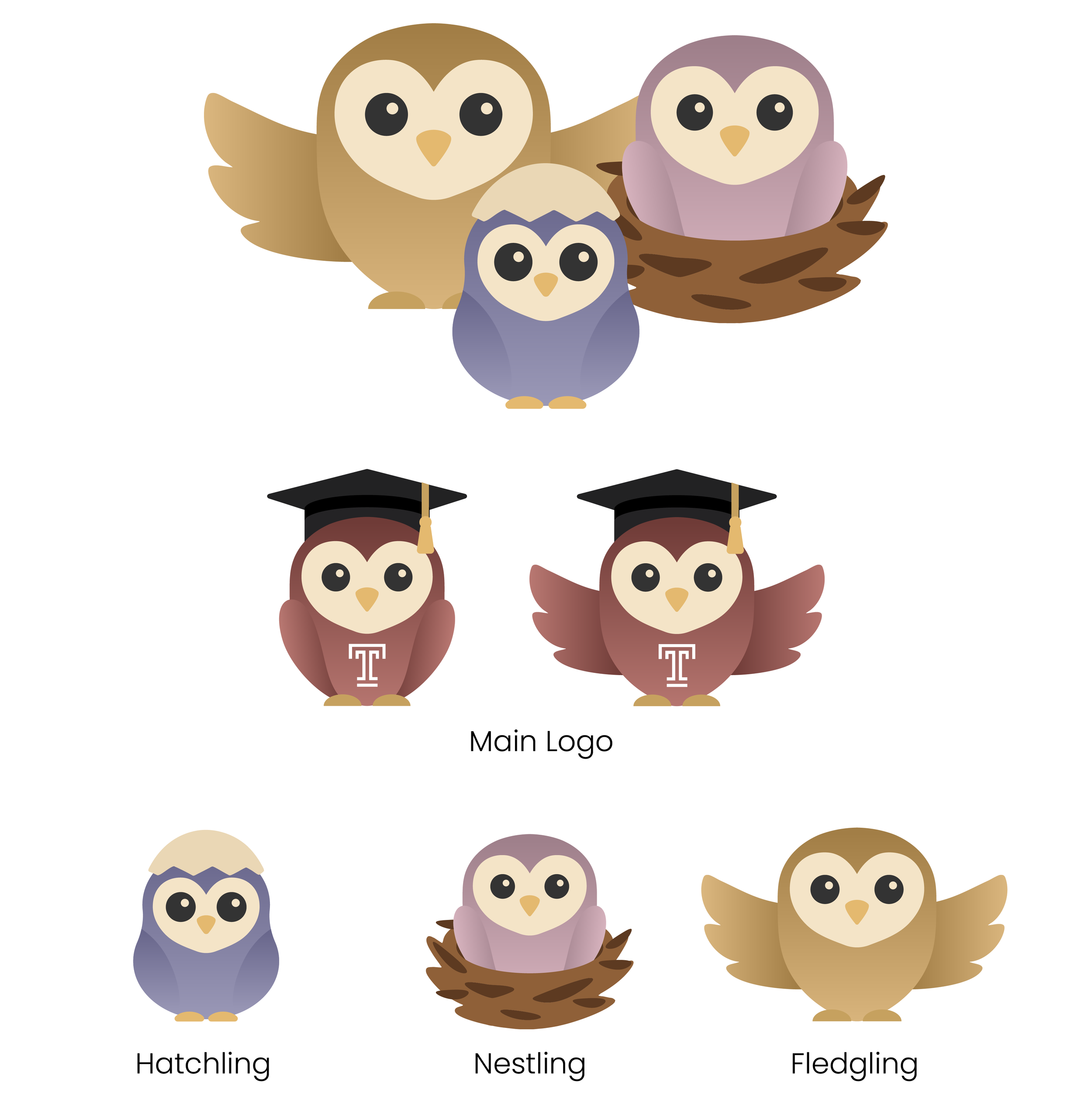
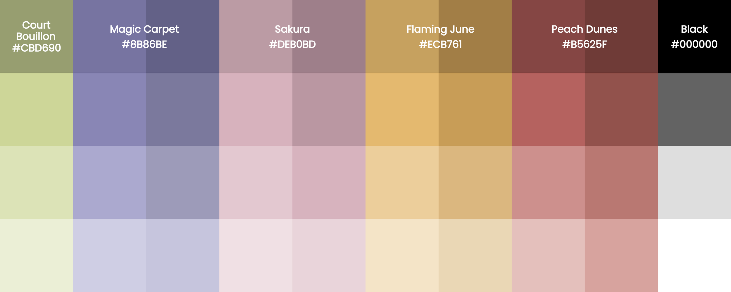
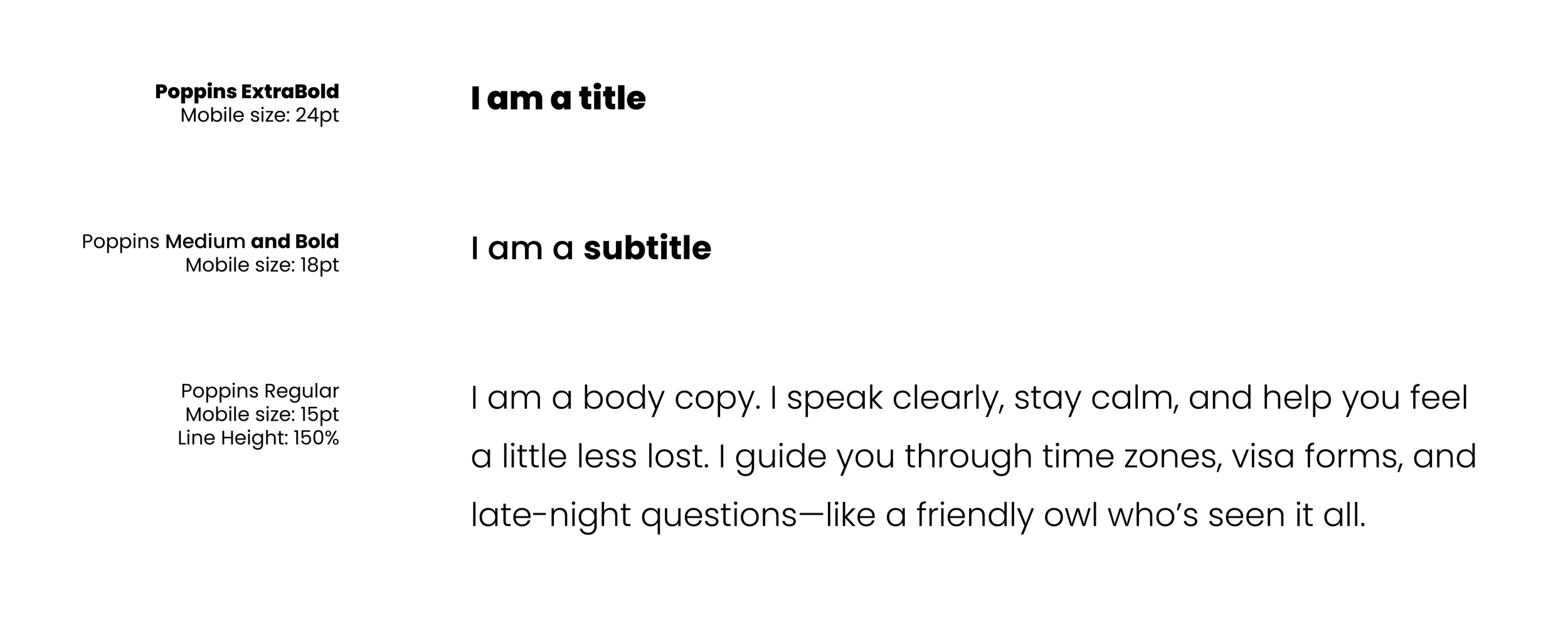
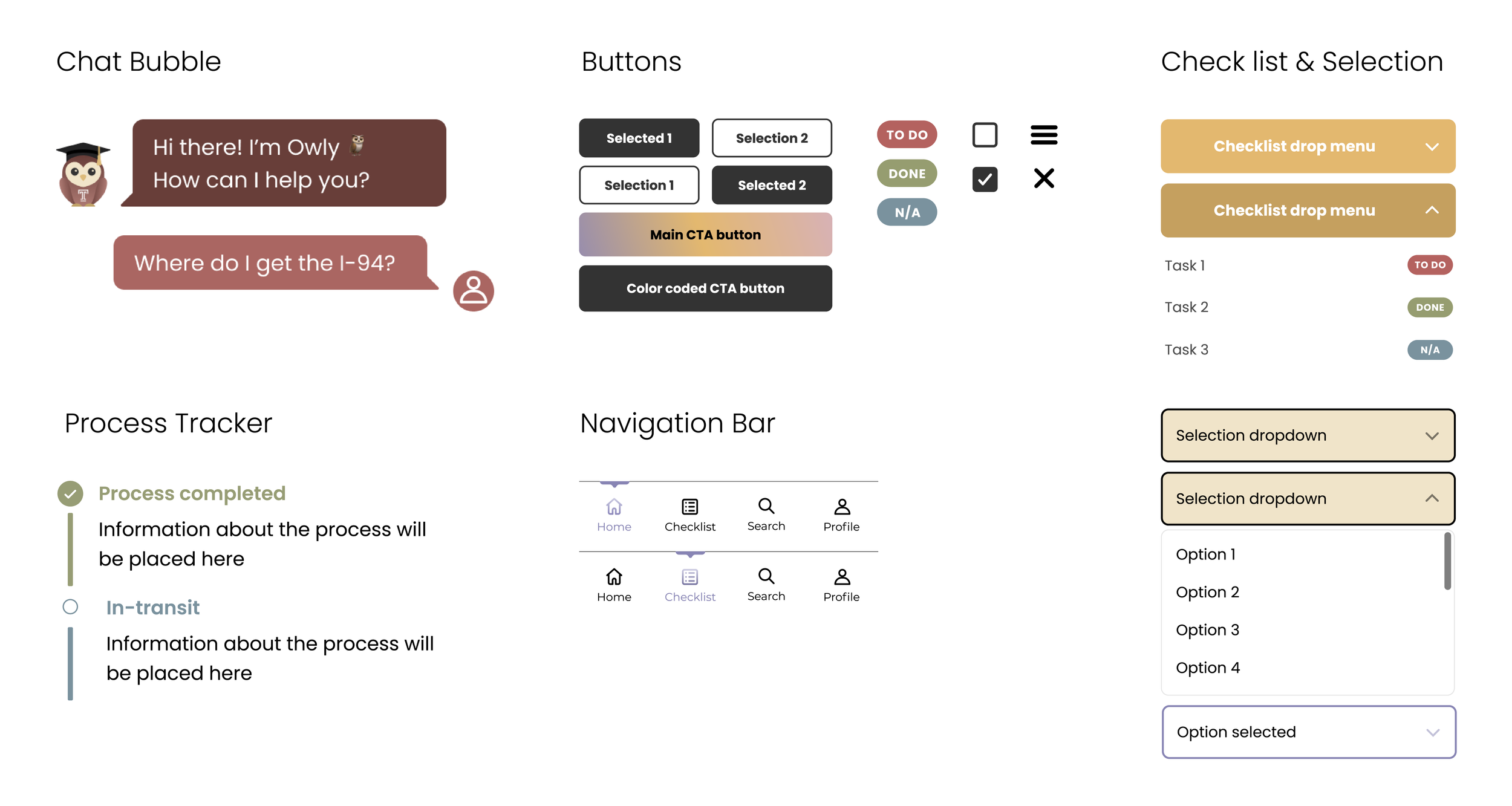
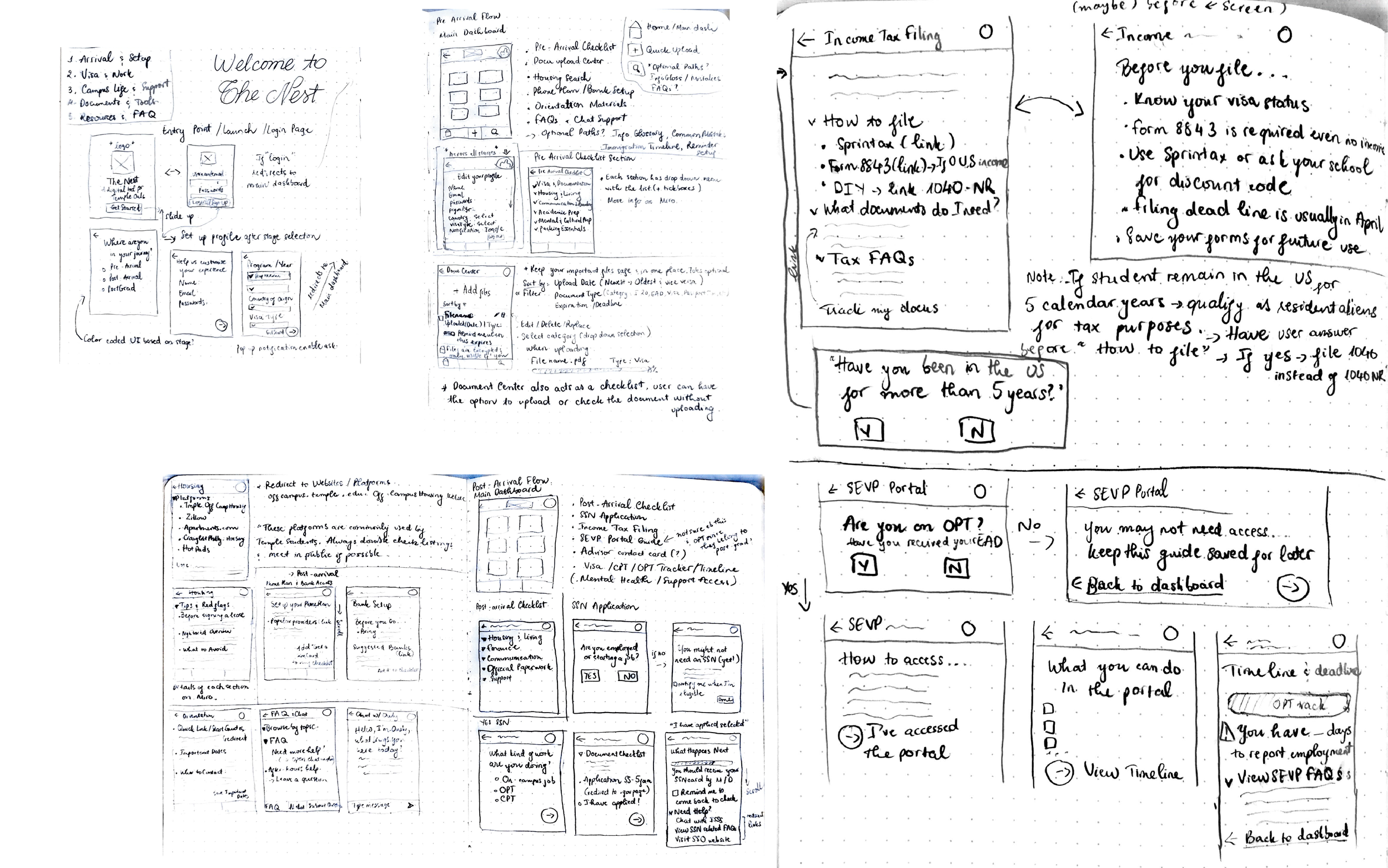
Logo sketches explored symbols of care and direction. The final logo combines a location pin and a heart, representing both guidance and emotional support. Color iterations focused on warm, muted tones that communicate calm and approachability.
Final Results
❋
Final Results ❋
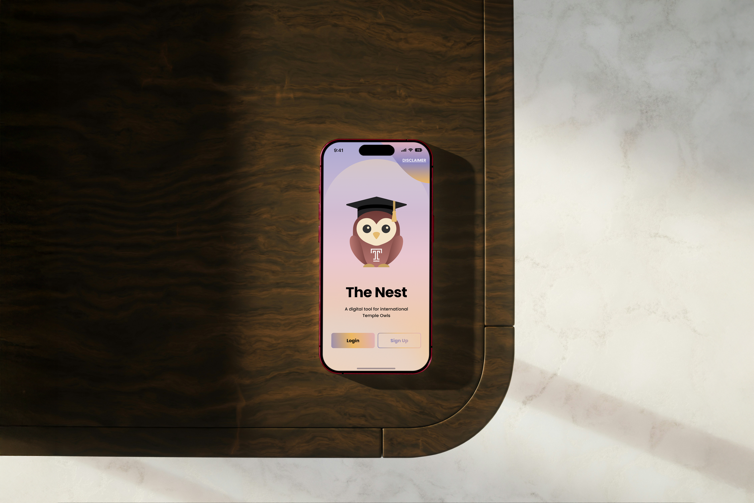
The final outcome is a high-fidelity Figma prototype designed for mobile use. The experience demonstrates how a stage-based framework can transform complex systems into a clearer path, while remaining flexible as students move forward. Onboarding, personalized resource access, and support features work together as a cohesive system.
What I Learned
❋
What I Learned ❋
Designing for community requires listening closely and staying adaptable. Organizing information by stage reduces stress by aligning guidance with readiness rather than volume. Grounding the work in lived experience and student voices led to decisions that felt practical and respectful. Visual clarity and tone played a critical role in shaping trust, turning information into guidance students could realistically use.