Tap the Market: A Game of Brews, Bids, and Bravado
Board Game Design
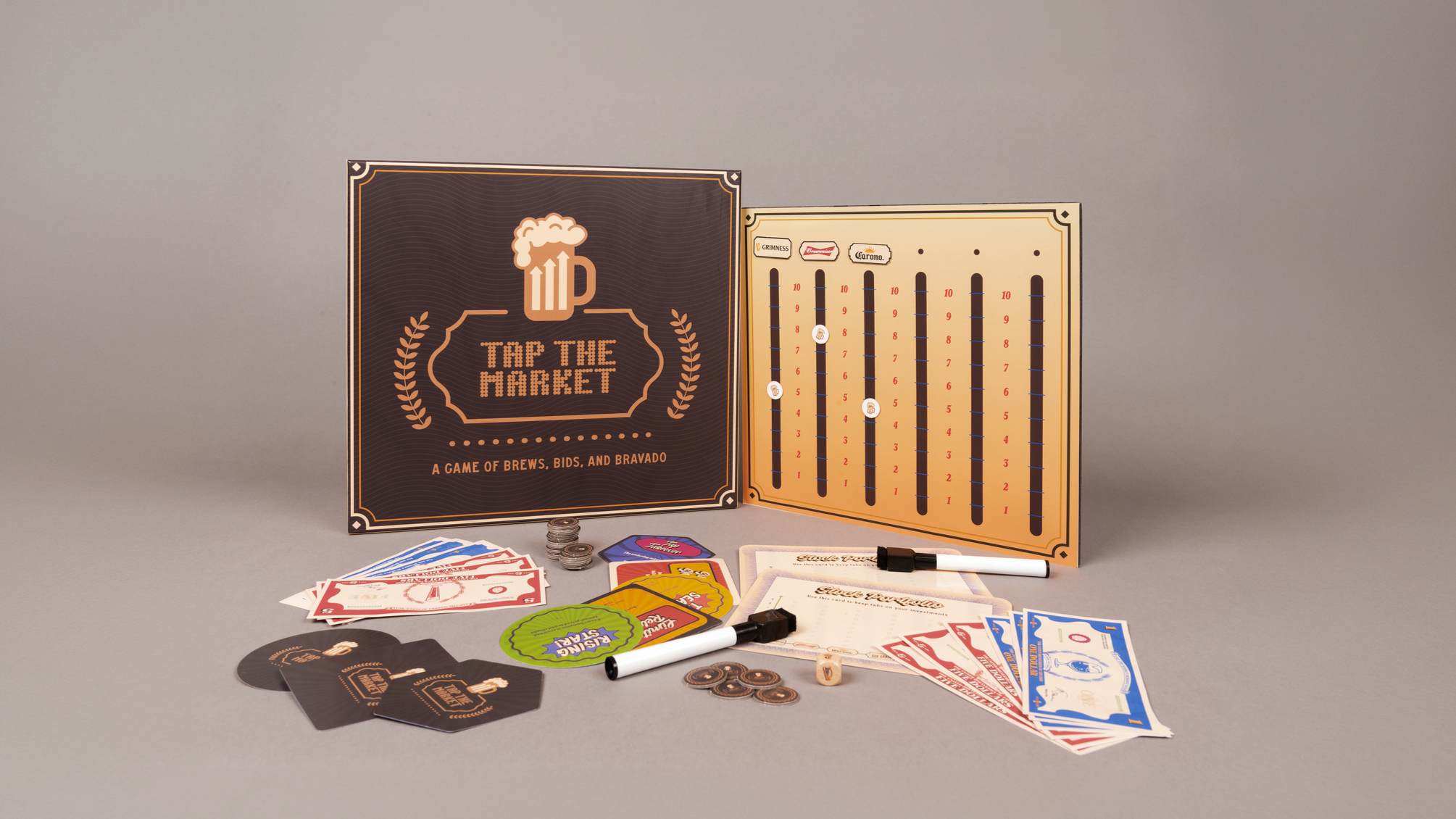
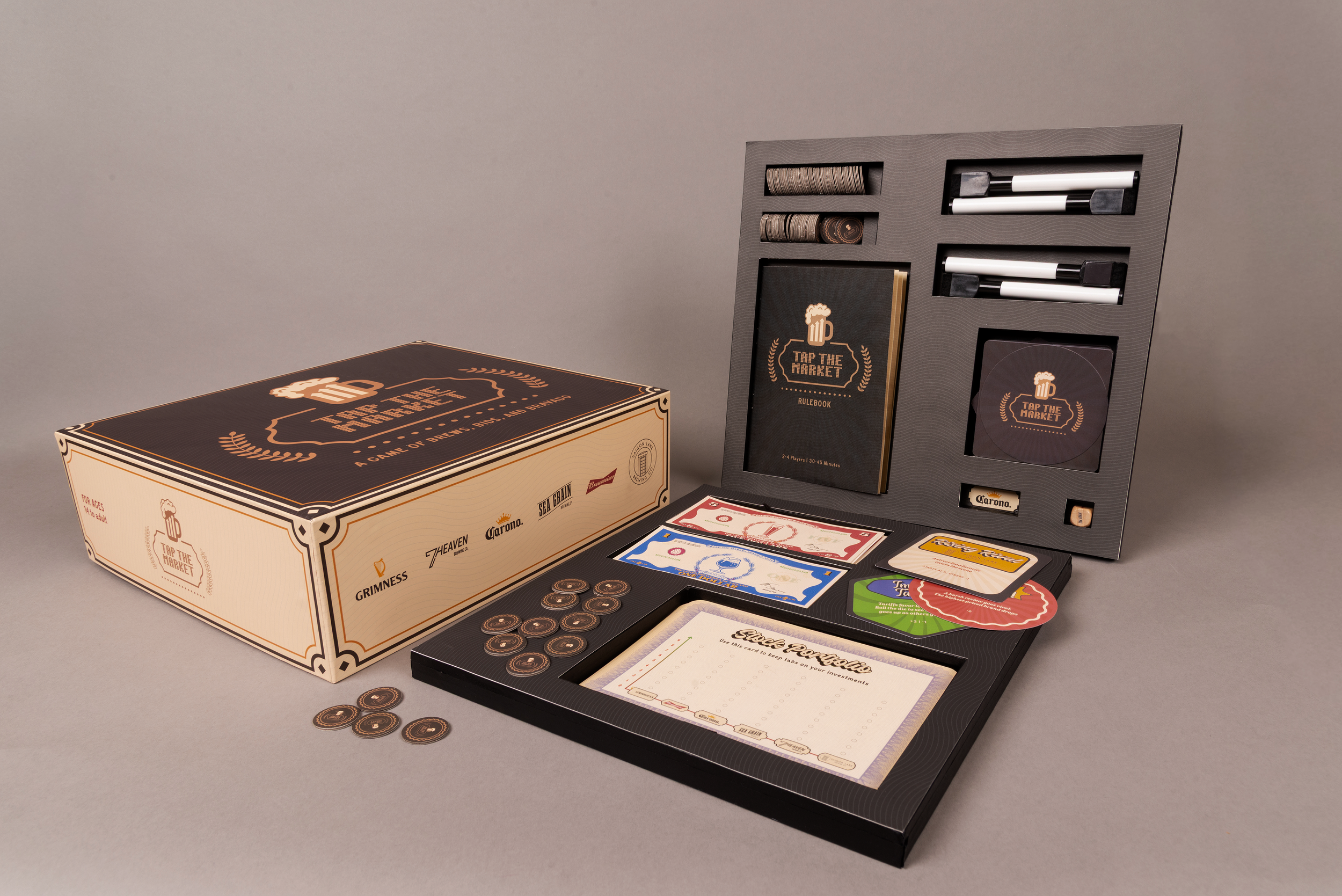
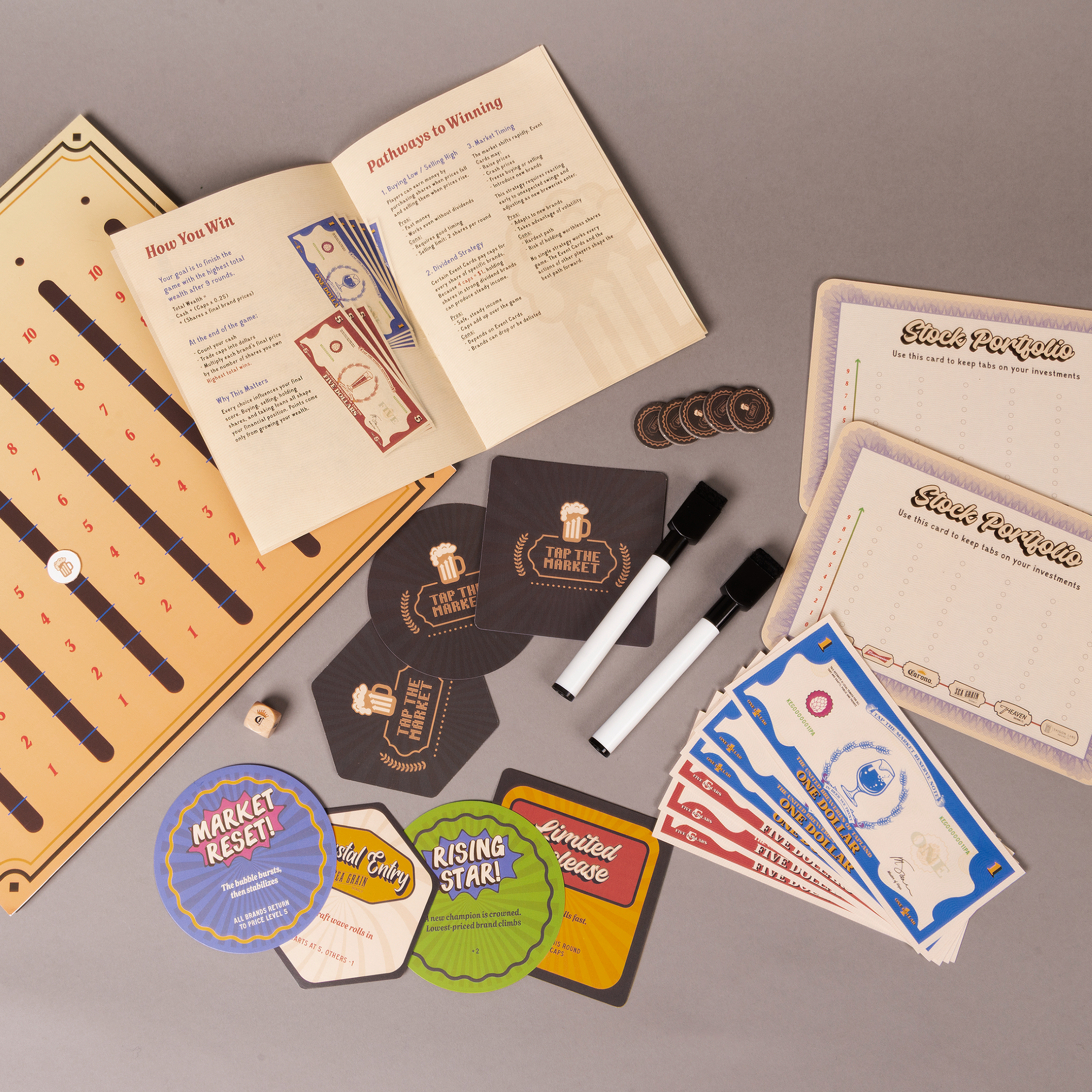
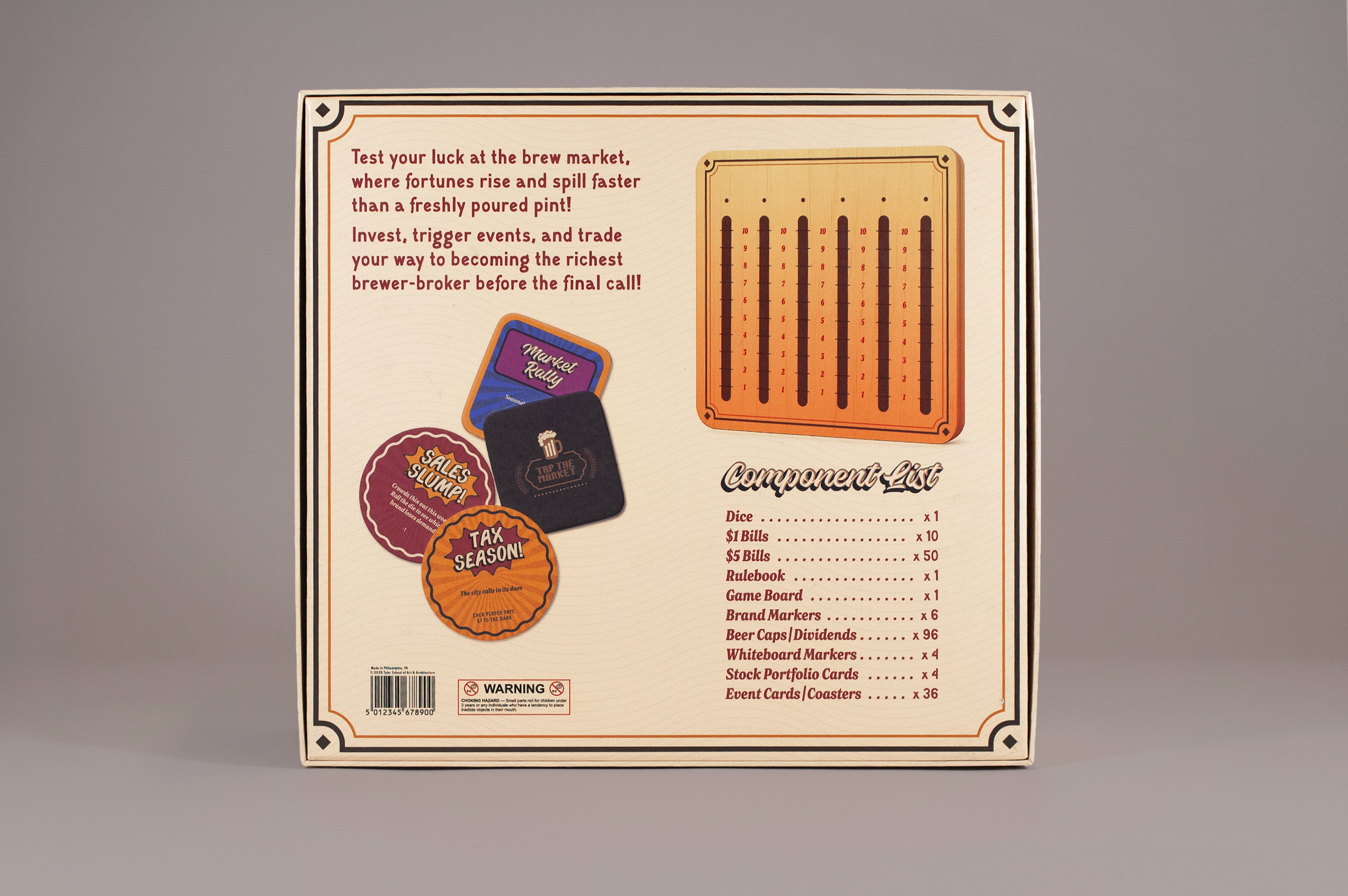
Tap the Market is a beer-themed strategy board game for 2 to 4 players that makes stock market mechanics approachable through bar culture. Players buy and sell shares in fictional breweries, collect bottle caps as dividends, and react to a deck of event cards that keep prices moving every round. The project came from a personal interest in financial literacy, and a feeling that trading, investing, and market logic are concepts most people learn too late or never at all. Wrapping those systems inside something social and familiar was the design challenge.
The Process
❋
The Process ❋
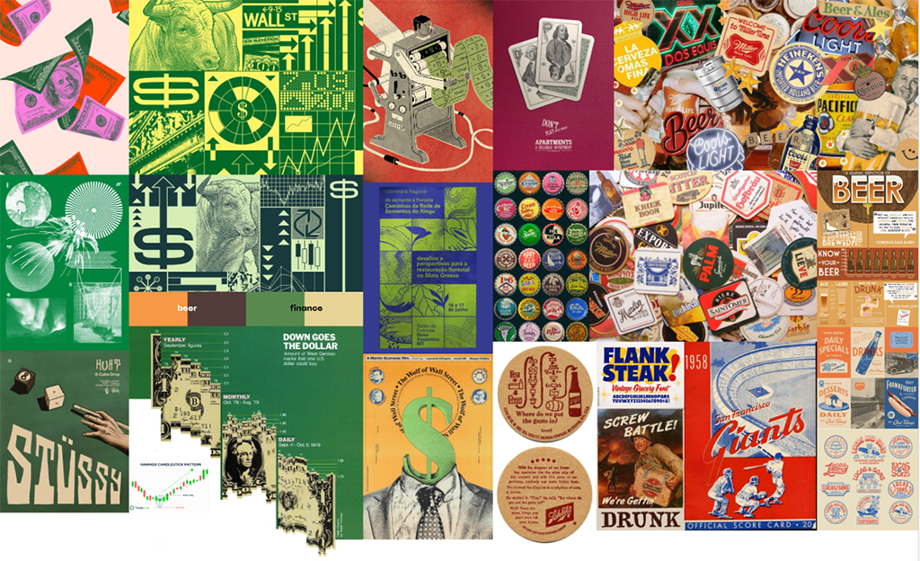
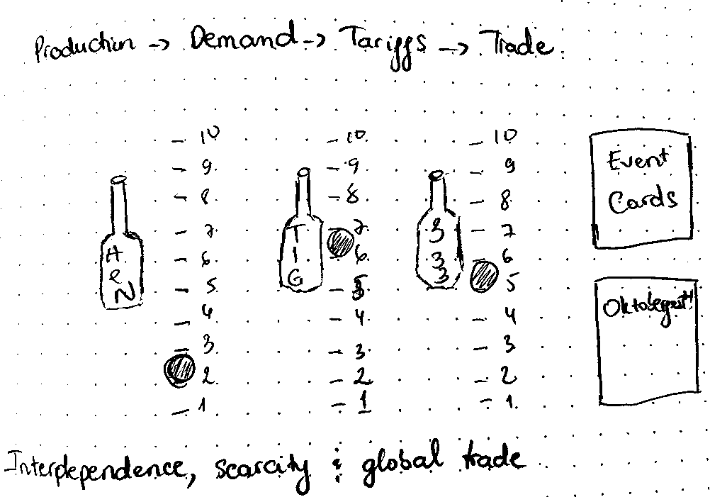
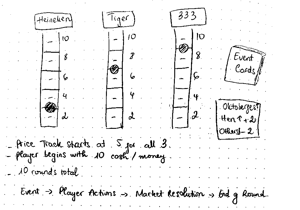
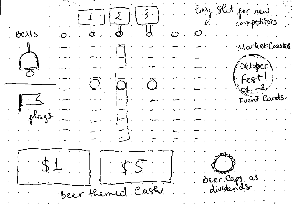
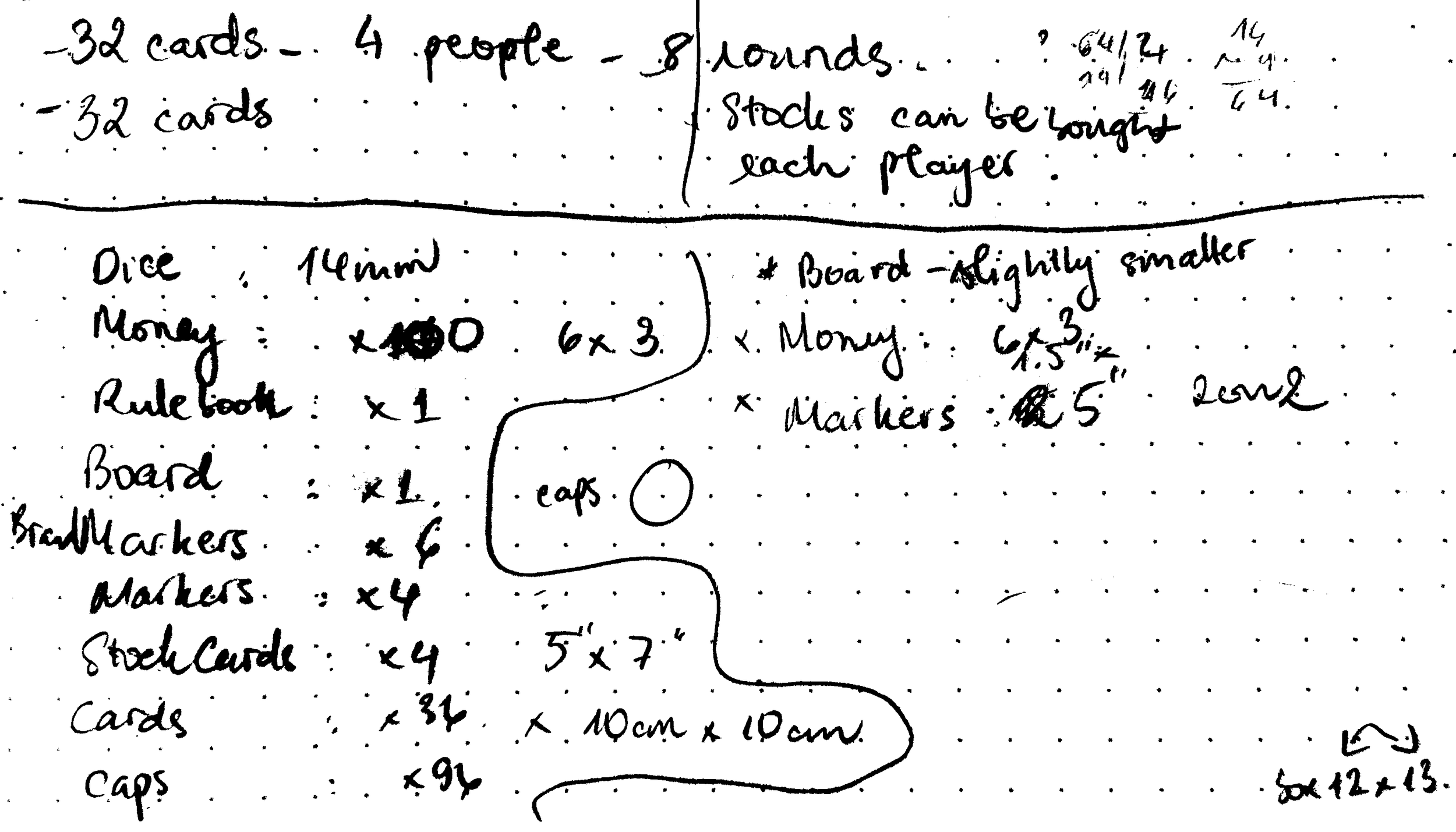
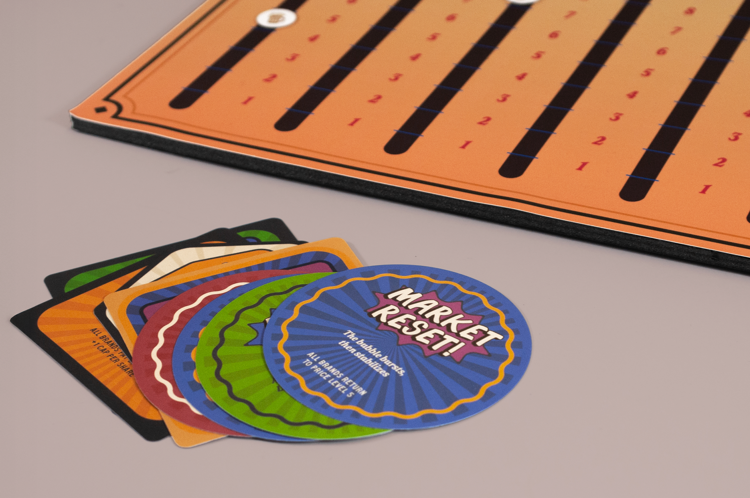
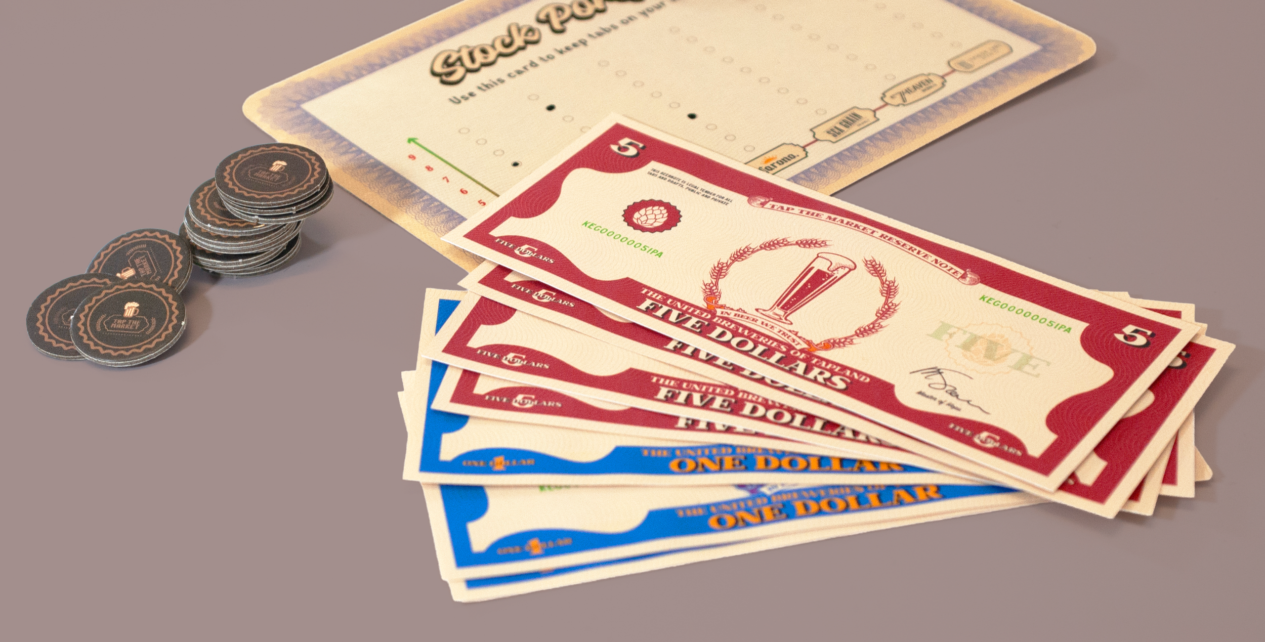
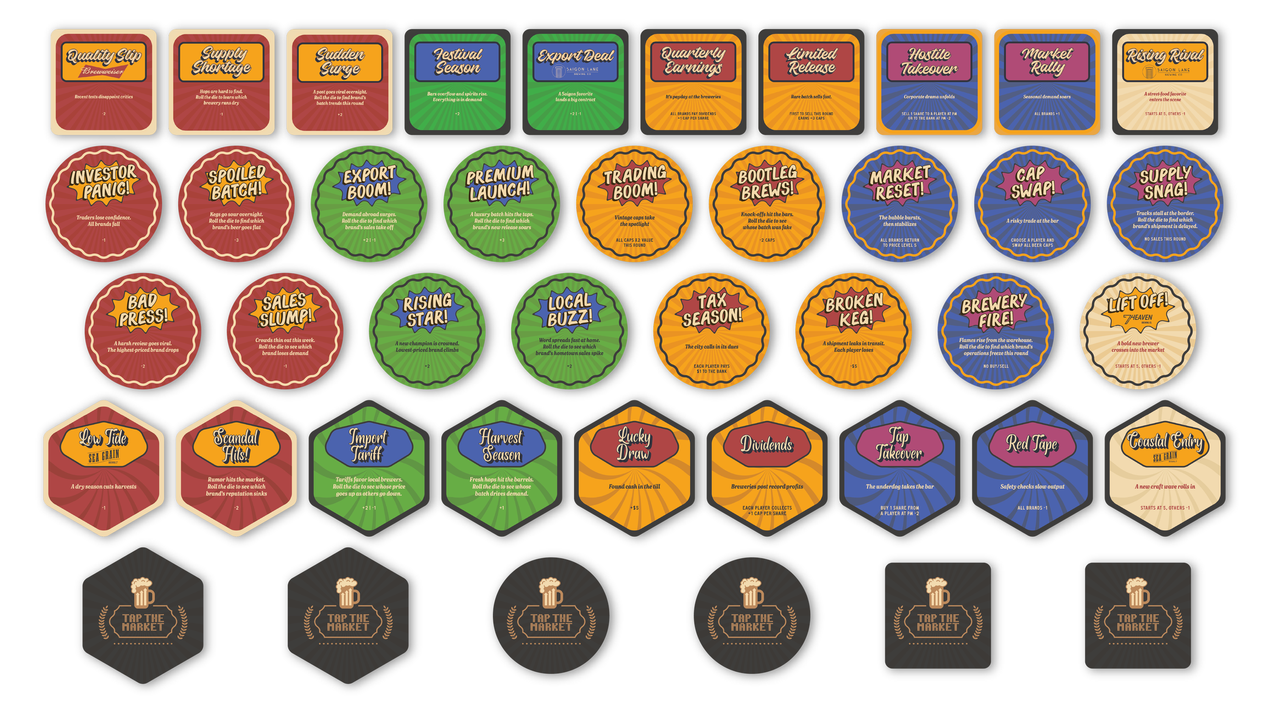
The project started with a moodboard pulling from two visual worlds that don't usually share a wall: financial print culture, with its engraved portraits and stock ticker typography, and the nostalgic badge-heavy graphic language of beer branding. Paper sketches worked out the game mechanics first, mapping price tracks, round structures, and how concepts like dividends, freezes, loans, and brand delisting would actually function before any visual decisions were made. The brands, the currency, the coaster-shaped event cards, and the whiteboard portfolio boards all came out of that back-and-forth between system thinking and physical form.
Final Results
❋
Final Results ❋
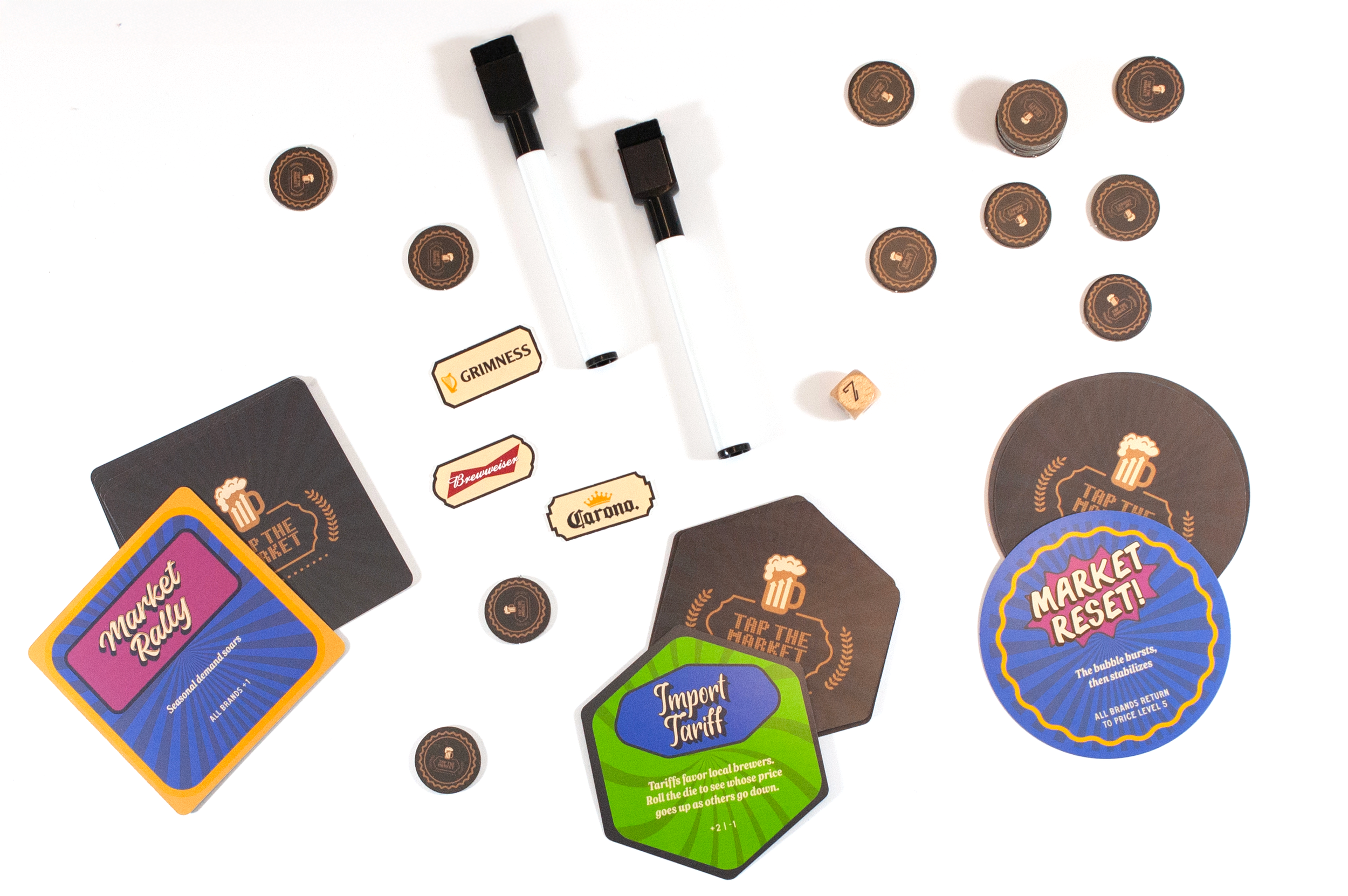
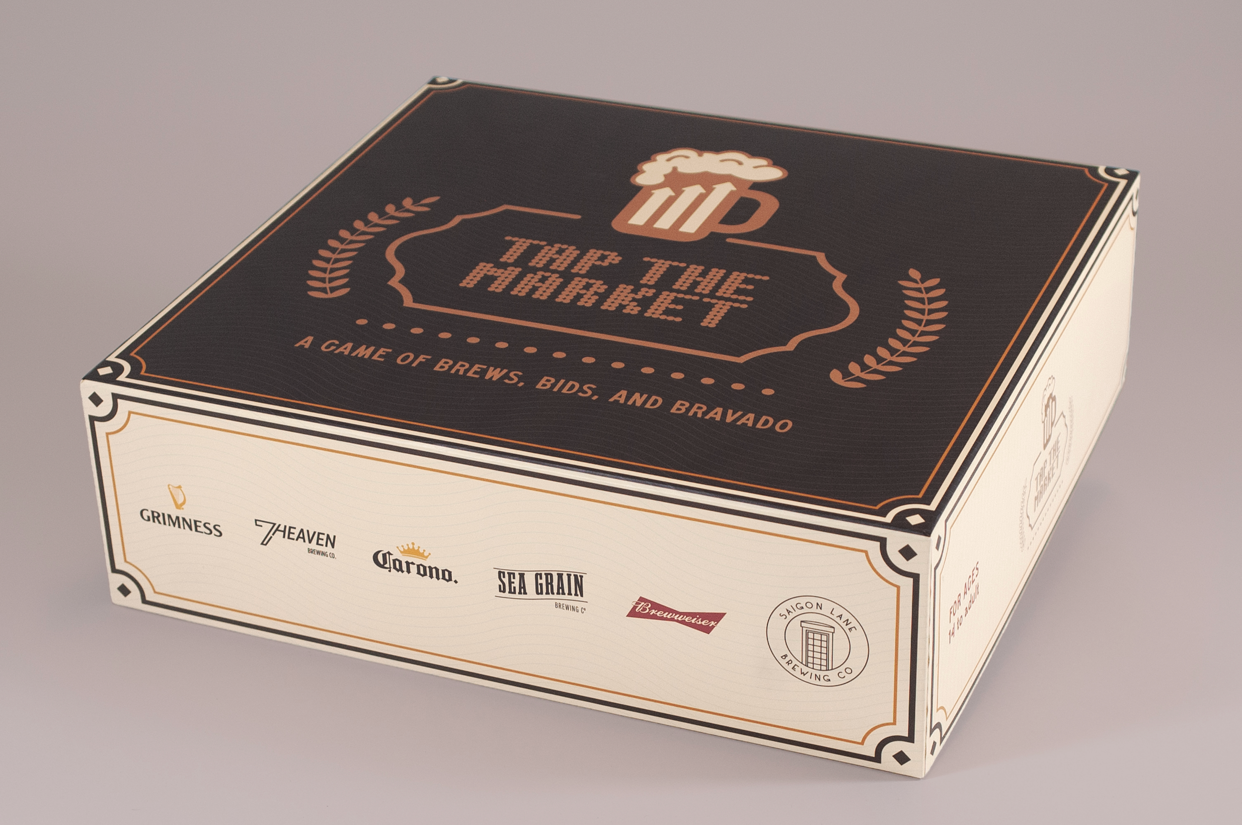
The finished game brings together a price board, coaster-shaped event cards, custom currency, bottle cap tokens, portfolio boards, and a rulebook, all carrying the same visual language from the earliest sketches through to the box. More than a collection of components, it became a way to make financial concepts like dividends, market volatility, and risk feel tangible enough to play with. Sitting around the board, watching a brand get delisted, collecting caps round by round, taking out a loan and sweating the interest. Those moments do the teaching without announcing it. That was always the goal.
Instruction by and special thanks to Scott Laserow
Project photography by Isabella Drescher and Scott Laserow
@ Tyler School of Art and Architecture, Temple University