The Nest: A Digital Tool for International Students
UX/UI Design
☆ AIGA BALTIMORE FLUX 2025 STUDENT DESIGN FINALIST
☆ DESIGN & ILLUSTRATION AWARD FOR RESEARCH AND PROCESS
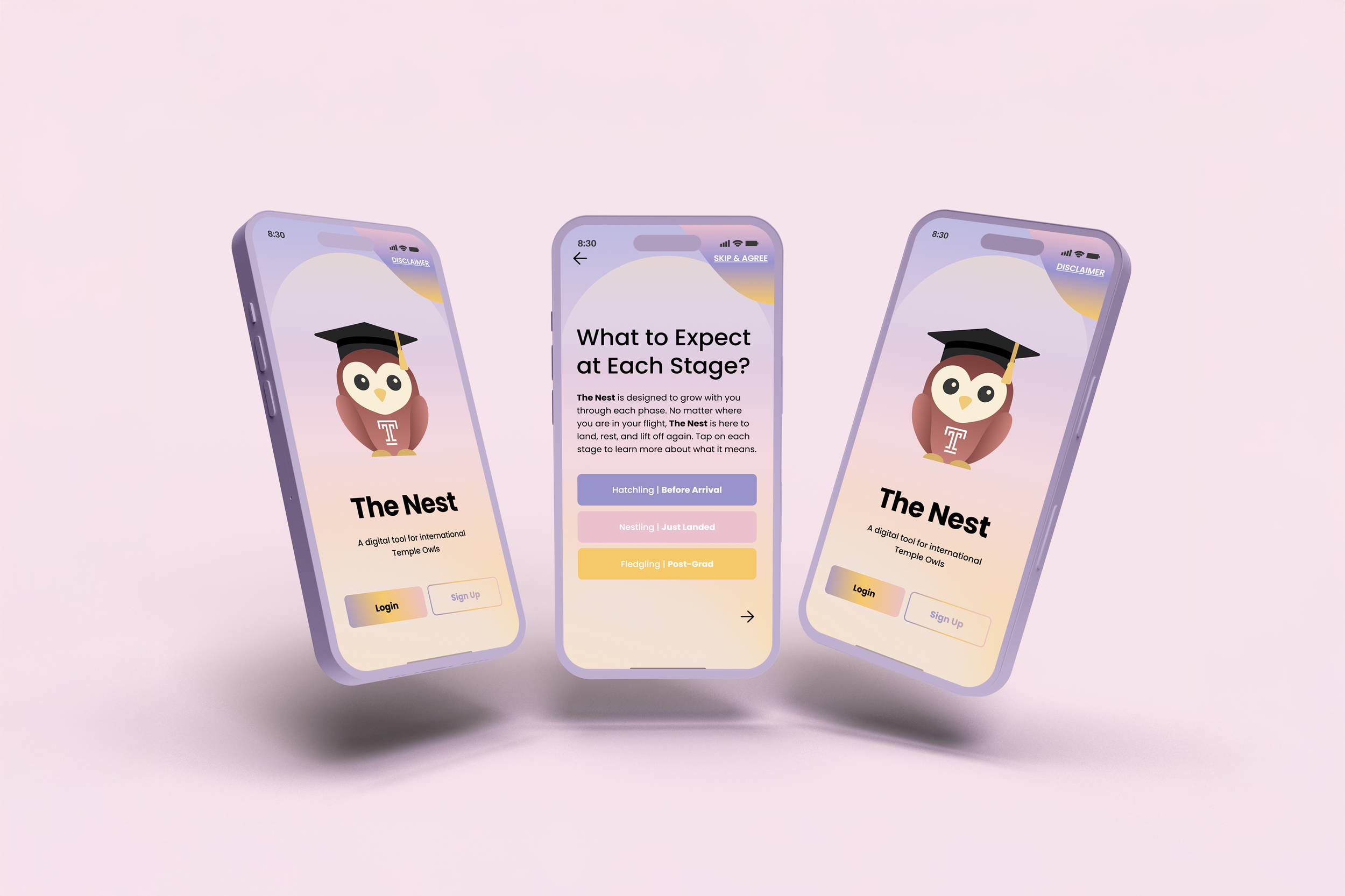
The Nest is a mobile app concept designed to support Temple University’s international students as their needs shift over time. Instead of treating support as a static list of services, the app organizes resources by stage, from preparing to arrive, to settling in, to planning next steps after graduation. This structure reflects how studying abroad actually unfolds, where questions change quickly and timing shapes stress levels. By presenting guidance in stages, the experience becomes easier to follow and more dependable, while making room for peer knowledge and community programs alongside official resources.
The Challenge
❋
The Challenge ❋
International students often receive information too early, too late, or spread across disconnected systems. Important tasks are missed not due to carelessness, but due to unclear timing and conflicting instructions. At the same time, students at very different points in their journey are usually treated the same, even though their concerns are not. This creates stress, confusion, and hesitation around asking for help, especially when the consequences feel high.
The Solution
❋
The Solution ❋
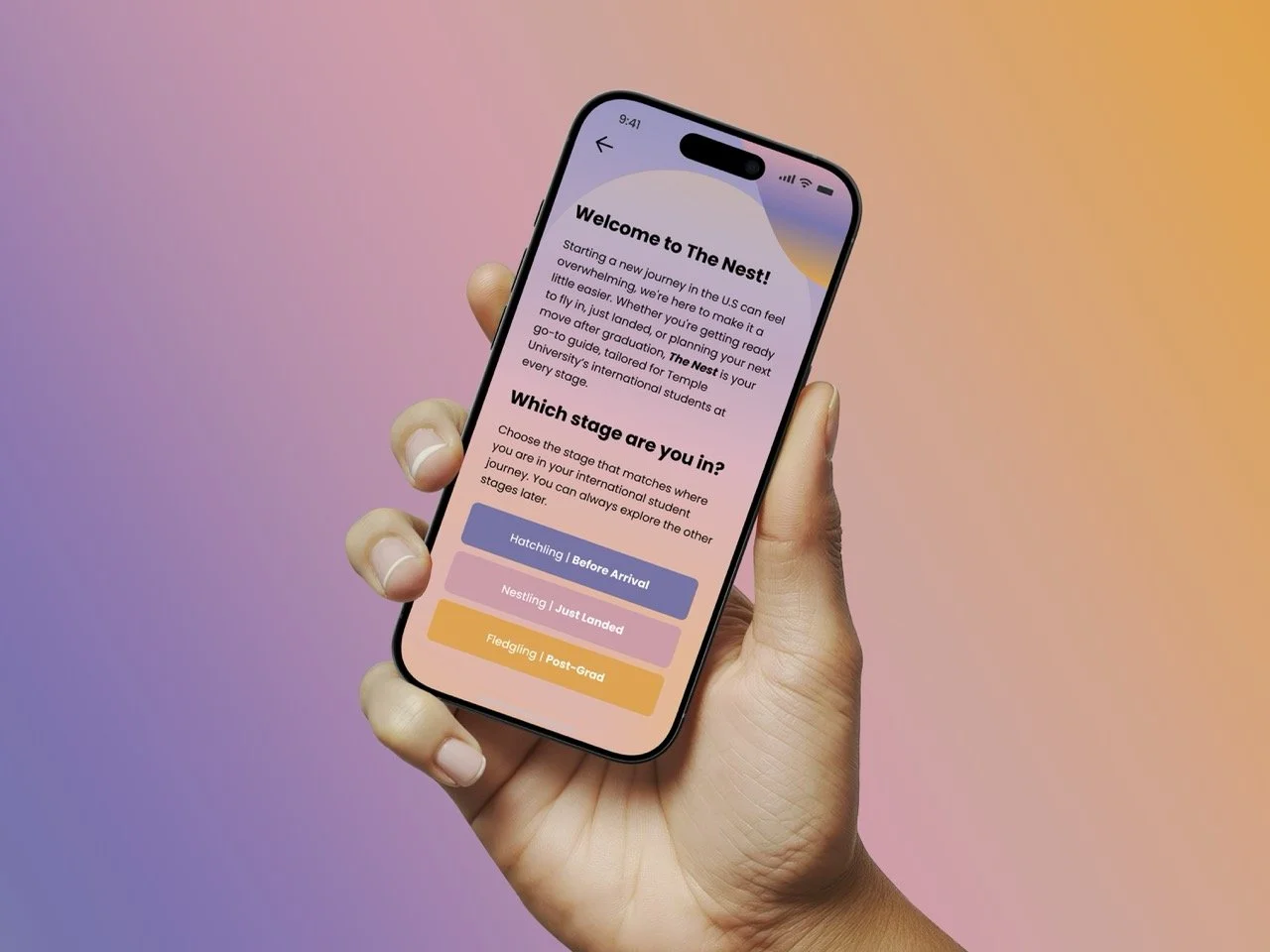
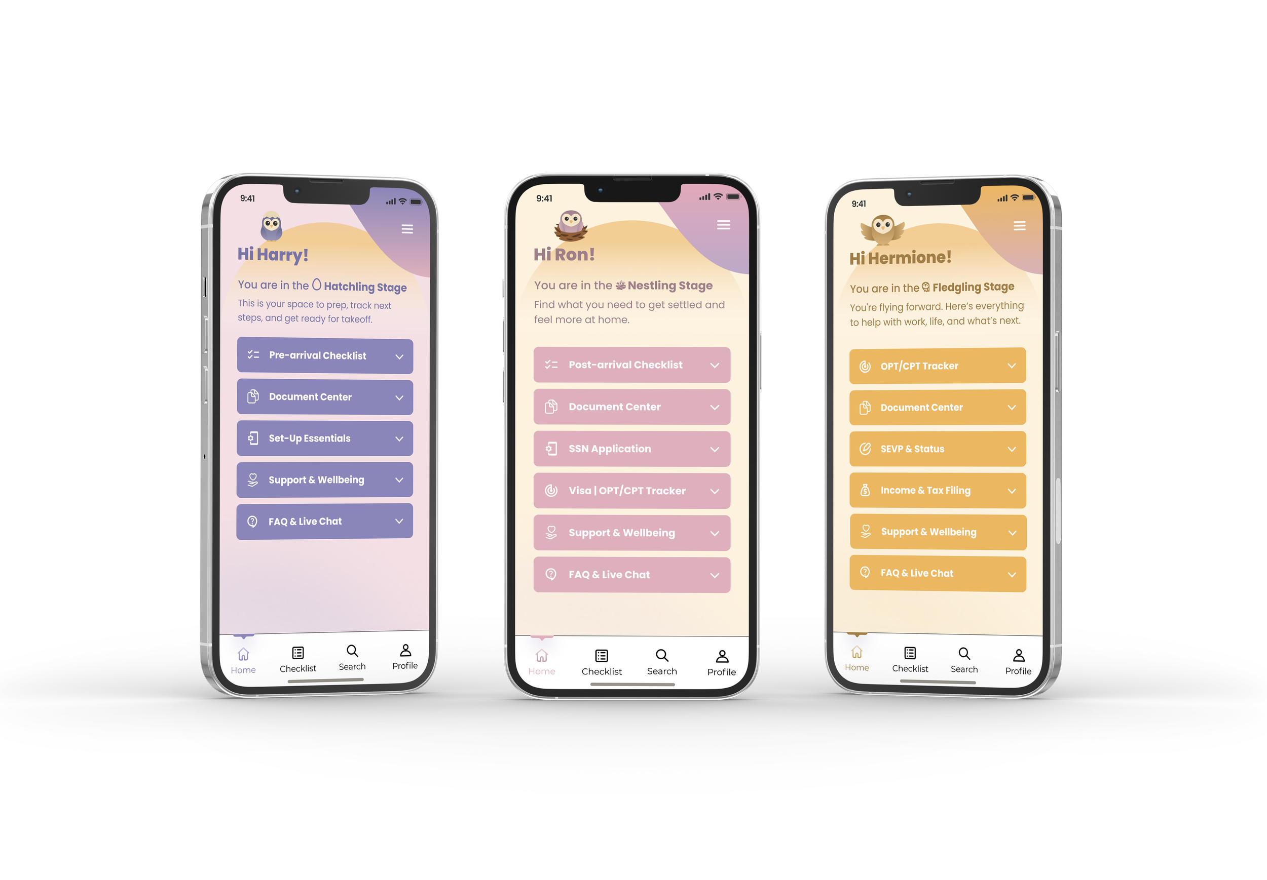
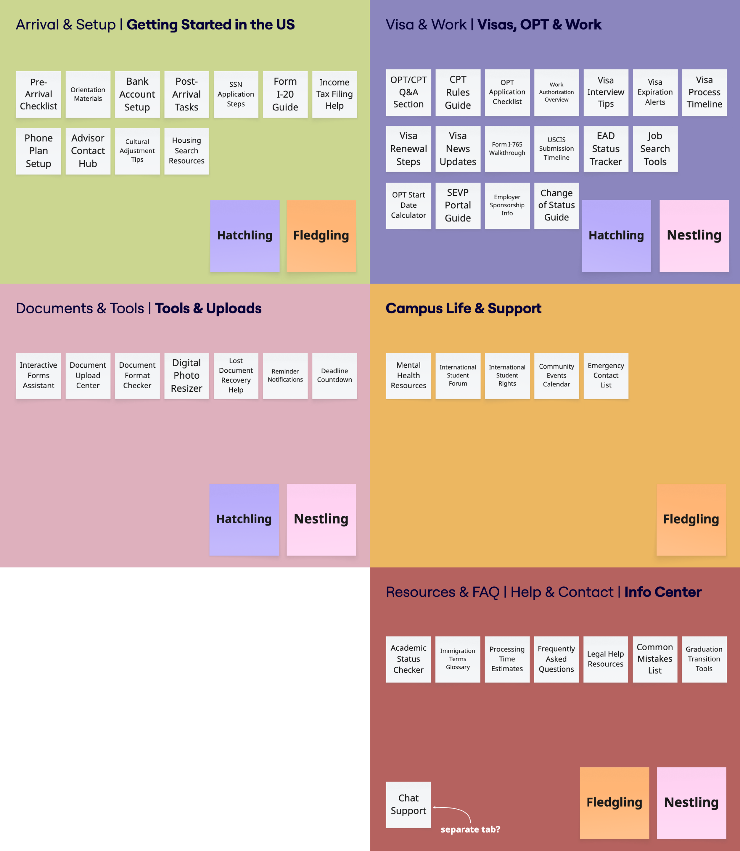
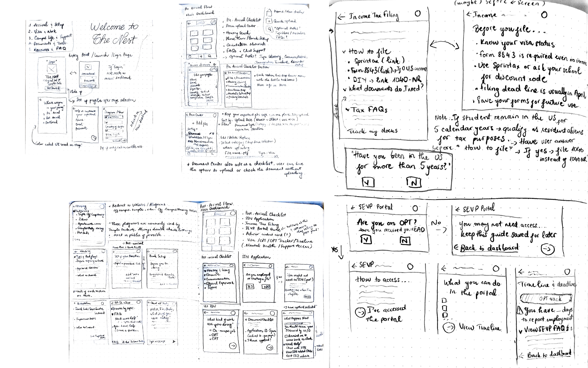
The Nest structures support around three stages: before arrival, just landed, and post-graduation. Each stage surfaces only the tools and information most relevant at that moment, reducing overload and making each visit feel purposeful. As students move forward, the app adapts with them, shifting from logistics and daily systems toward long-term planning and career support. This approach turns scattered information into guided steps that feel manageable and grounded.
The Research
❋
The Research ❋
Research shaped both the structure and tone of the app. Surveys, interviews, and card sorting clarified how students understand their needs over time and how they mentally group information. These insights informed the stage model, the navigation system, and the decision to balance institutional resources with peer-driven knowledge.
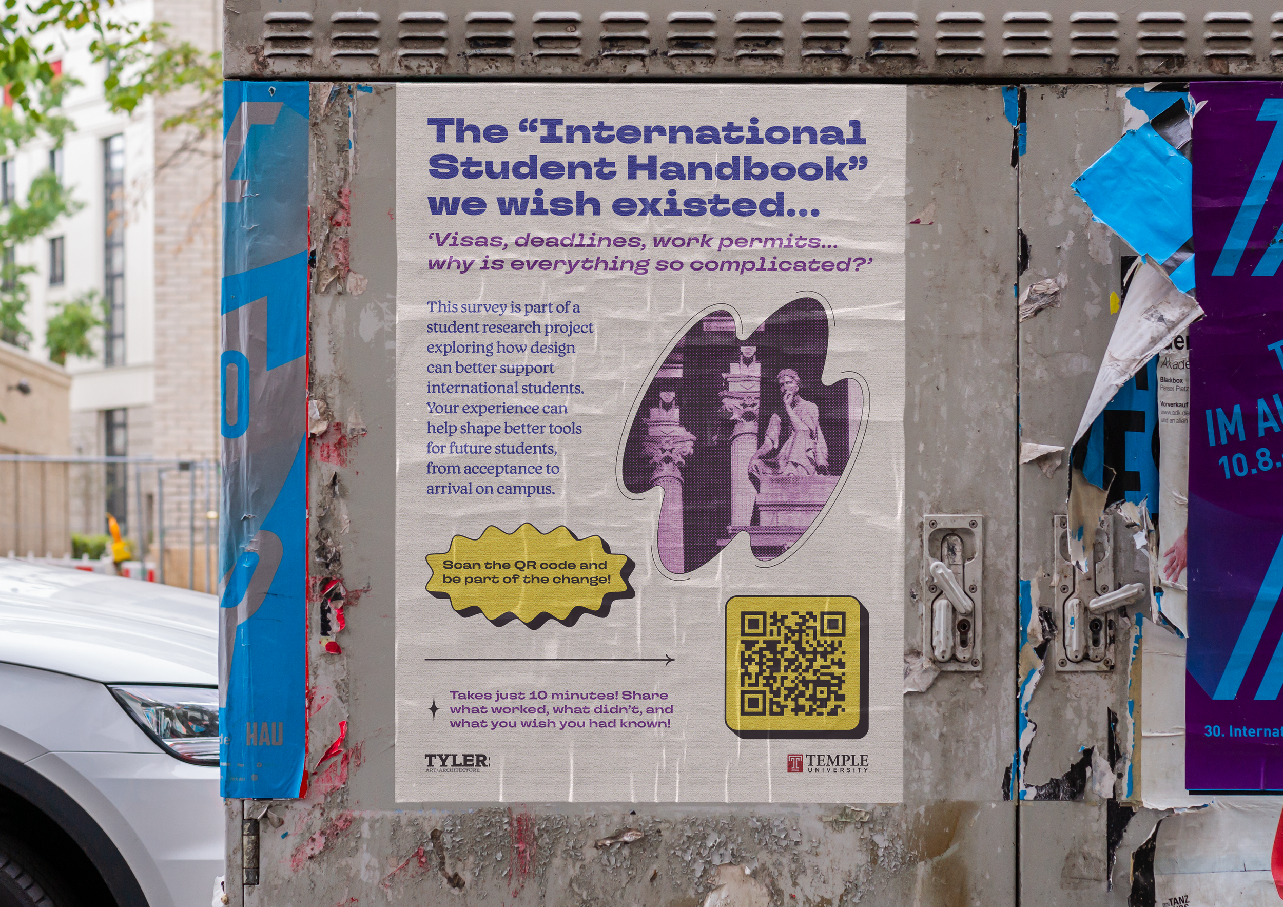
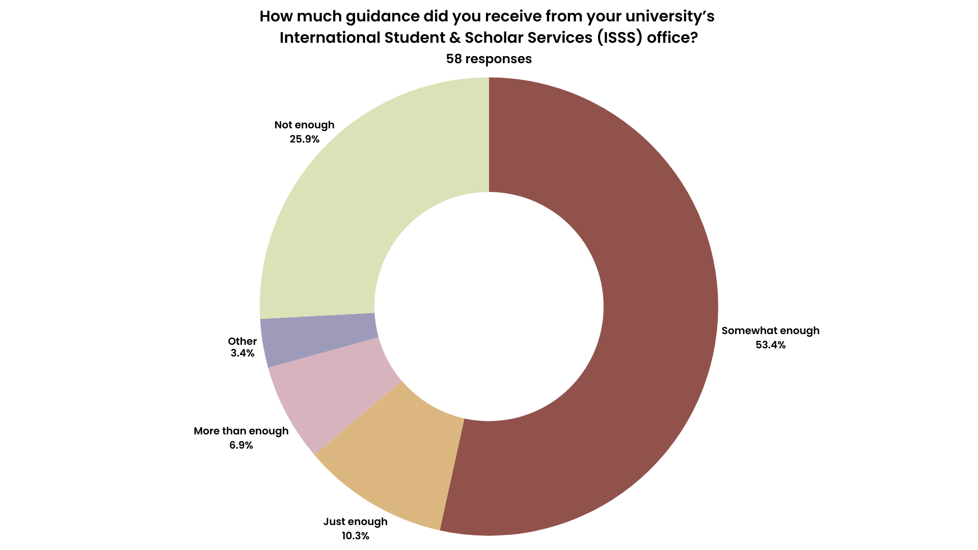
User Surveys
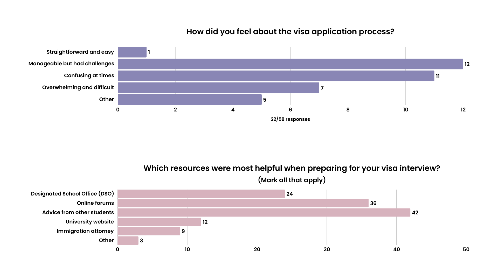
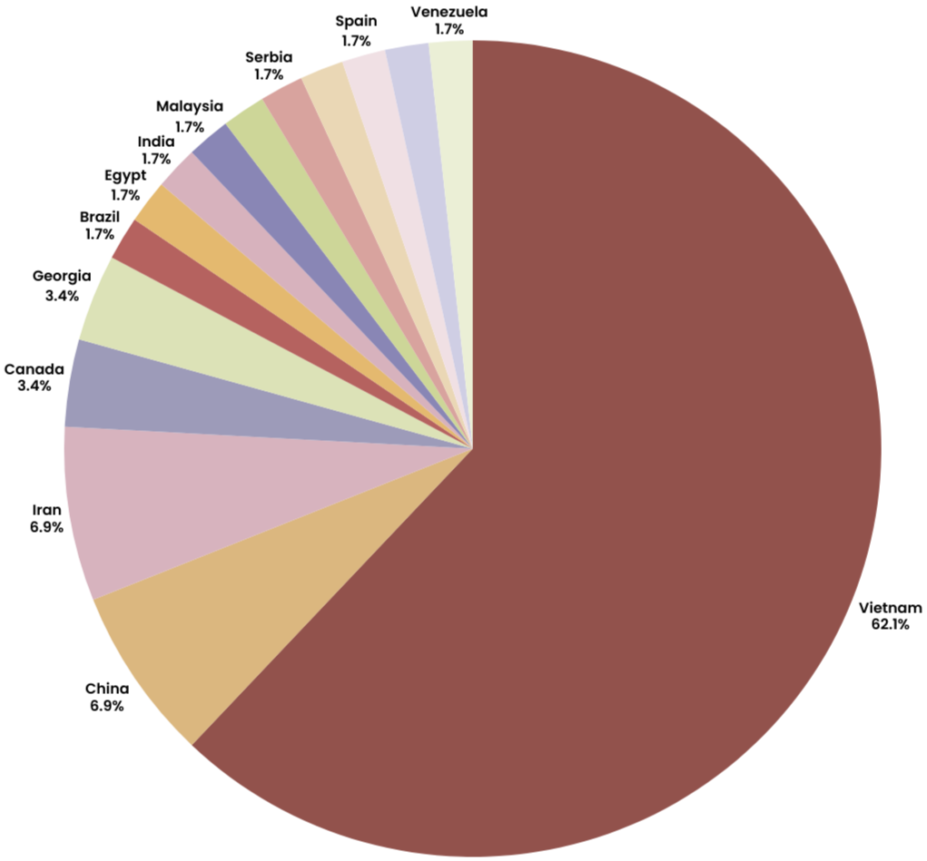
The research shaped almost everything. I surveyed 58 international students across different academic levels and visa situations, and I kept hearing versions of the same frustration. A lot of stress came from unclear timelines, repeated paperwork, and not knowing where the most reliable answer would come from. Many students said they turned to friends first, even when official resources existed, simply because those channels felt easier to understand in the moment. Vietnam shows up heavily in the responses, mostly because of my own social circles, but the patterns reached far beyond that.
Card Sorting
Card sorting made those patterns even clearer. Arrival logistics naturally grouped together. Daily life tasks formed their own cluster. Career planning kept showing up as something tied to a later stage, with a different emotional tone around it. That helped confirm that students were already thinking in phases, even if the systems around them were not. It also helped shape the app’s navigation and reinforced the idea that timing is part of usability.
"Vague language on the DHS website. Most of the process is really unclear. Not knowing if I did the thing right or wrong.”
"It’s a lot of tedious paperwork, and one mistake could cause your visa to be denied or revoked."
"Nuances and unspoken/inexplicit policy in the application process, timeline, and eligibility."
"Advisors mostly know about I-20, CPT, or OPT, but not other visa processes."
User Pain Points
Students struggled with tracking progress across multiple systems, understanding when tasks actually mattered, and asking questions without fear of making mistakes. These challenges often led to delays, duplicated effort, and added stress during already demanding transitions.
Insights
The research showed that students were motivated and proactive, yet lacked clarity and reassurance. A system that acknowledges timing, emotional pressure, and shared experience feels more supportive than one that simply provides information. Guidance works best when it meets students where they are in their own journey.
User Personas
❋
User Personas ❋
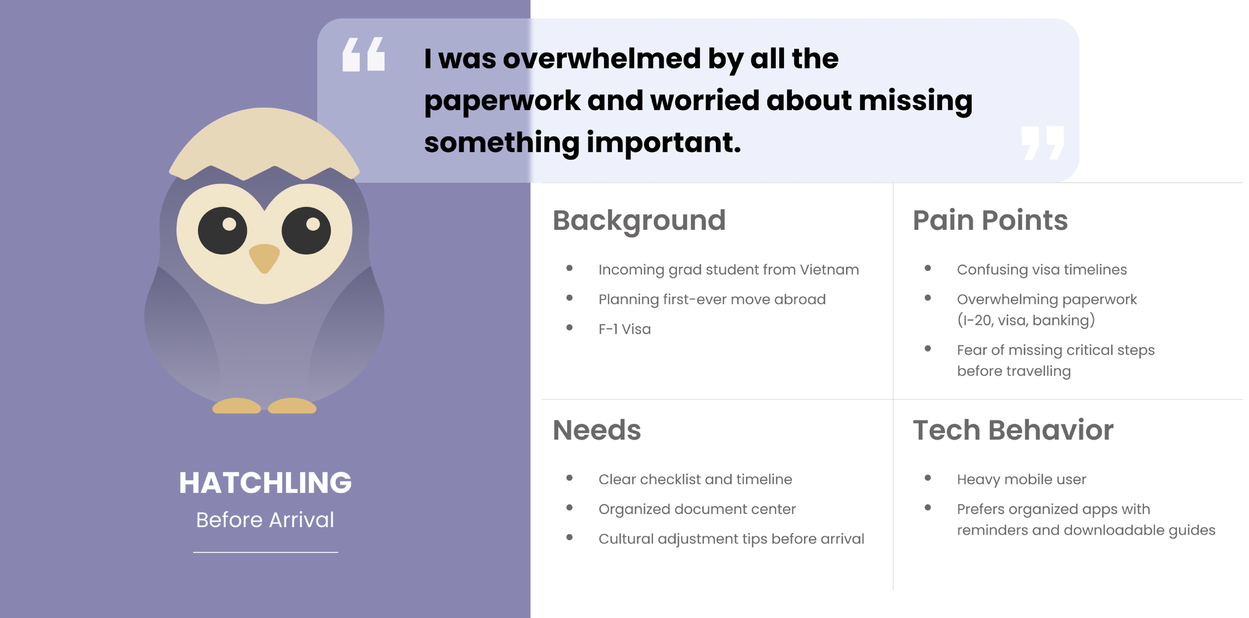
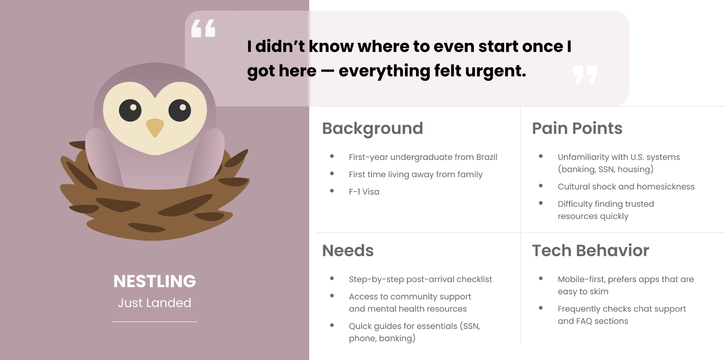
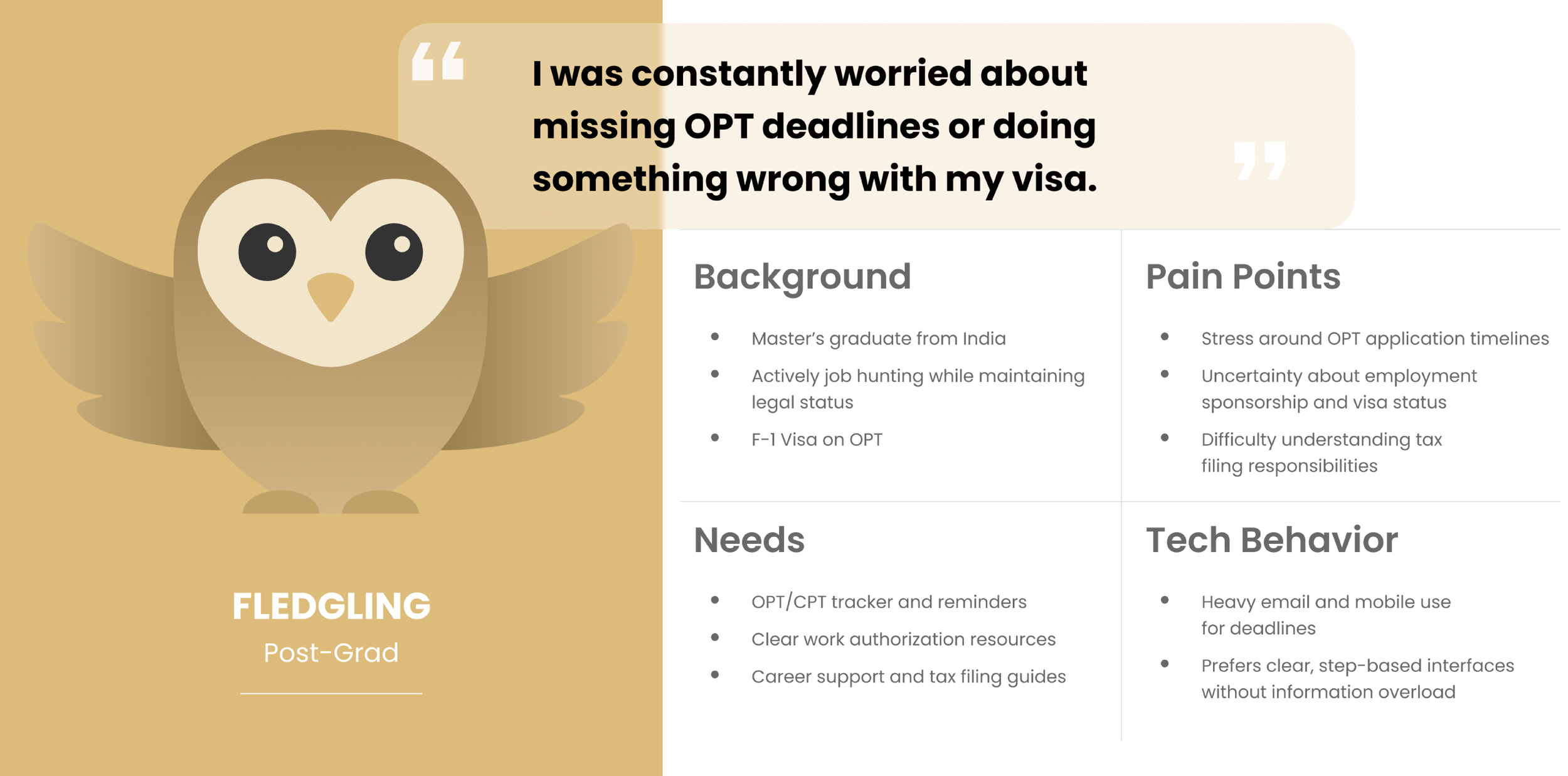
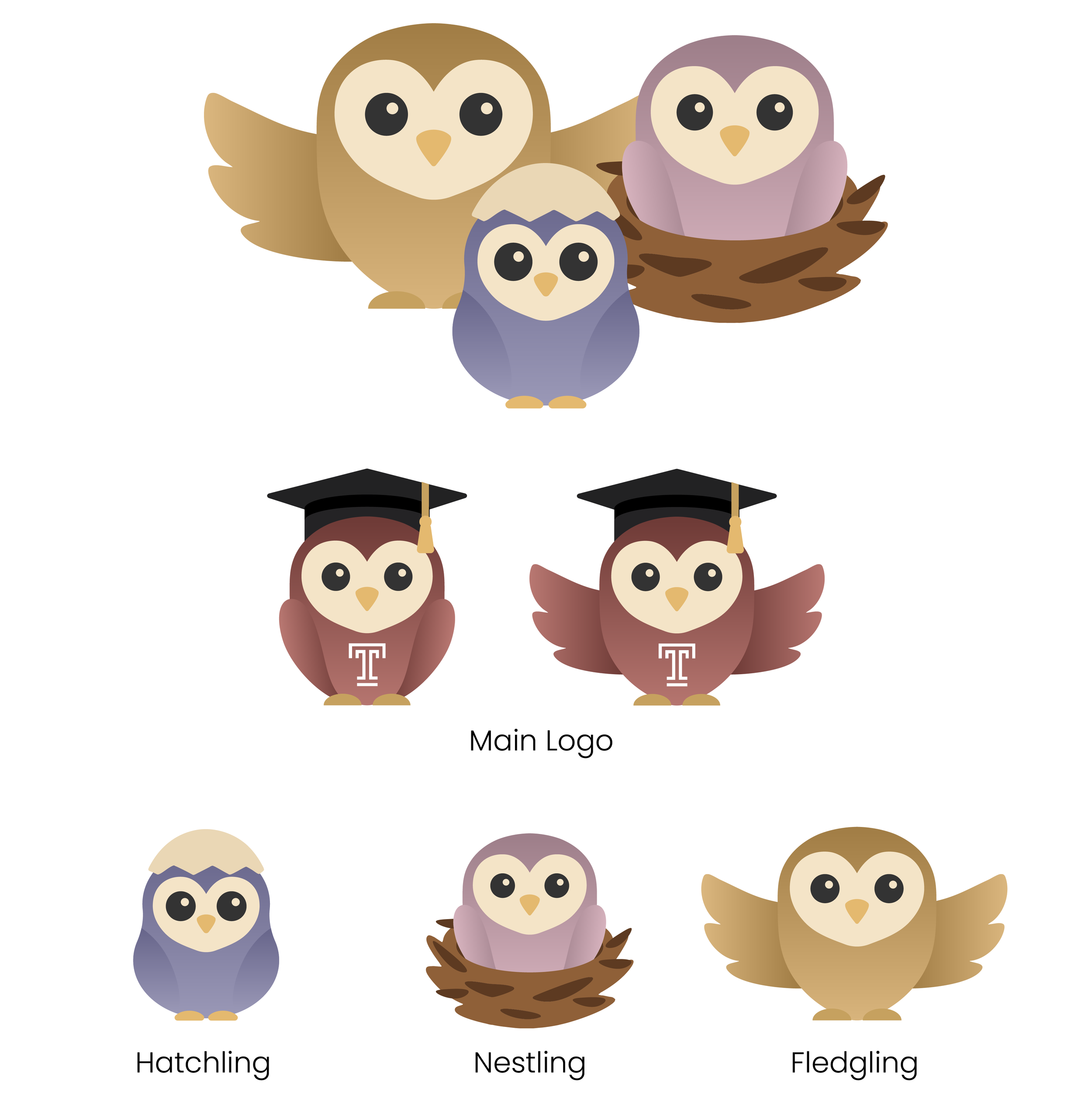
That thinking led to three personas, each tied to a stage of the journey. Hatchling represents students preparing to arrive, with most of their attention on documents, logistics, and the unknown. Nestling reflects newly arrived students trying to understand daily systems, campus life, and how to function in a new environment without feeling constantly behind. Fledgling represents students getting closer to graduation, when the focus starts shifting toward work authorization, job searching, and what comes next. These personas helped keep the design grounded in changing needs instead of abstract user categories.
Design Process
❋
Design Process ❋
The design process followed that same mindset. Early logo sketches looked at symbols tied to care, direction, and movement. The final logo combines a location pin and a heart, holding guidance and emotional support in the same form. I wanted it to feel warm without becoming childish, supportive without sounding overly polished. The color palette stayed in that space too. Warm, muted tones felt right for a project dealing with stress, uncertainty, and transition. The interface needed to feel calm enough to trust, but still alive.
Final Results
❋
Final Results ❋
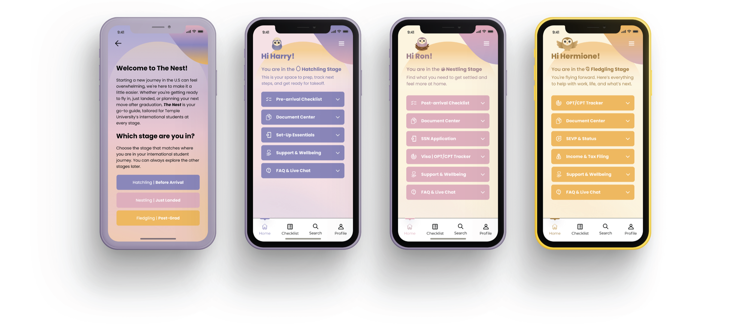
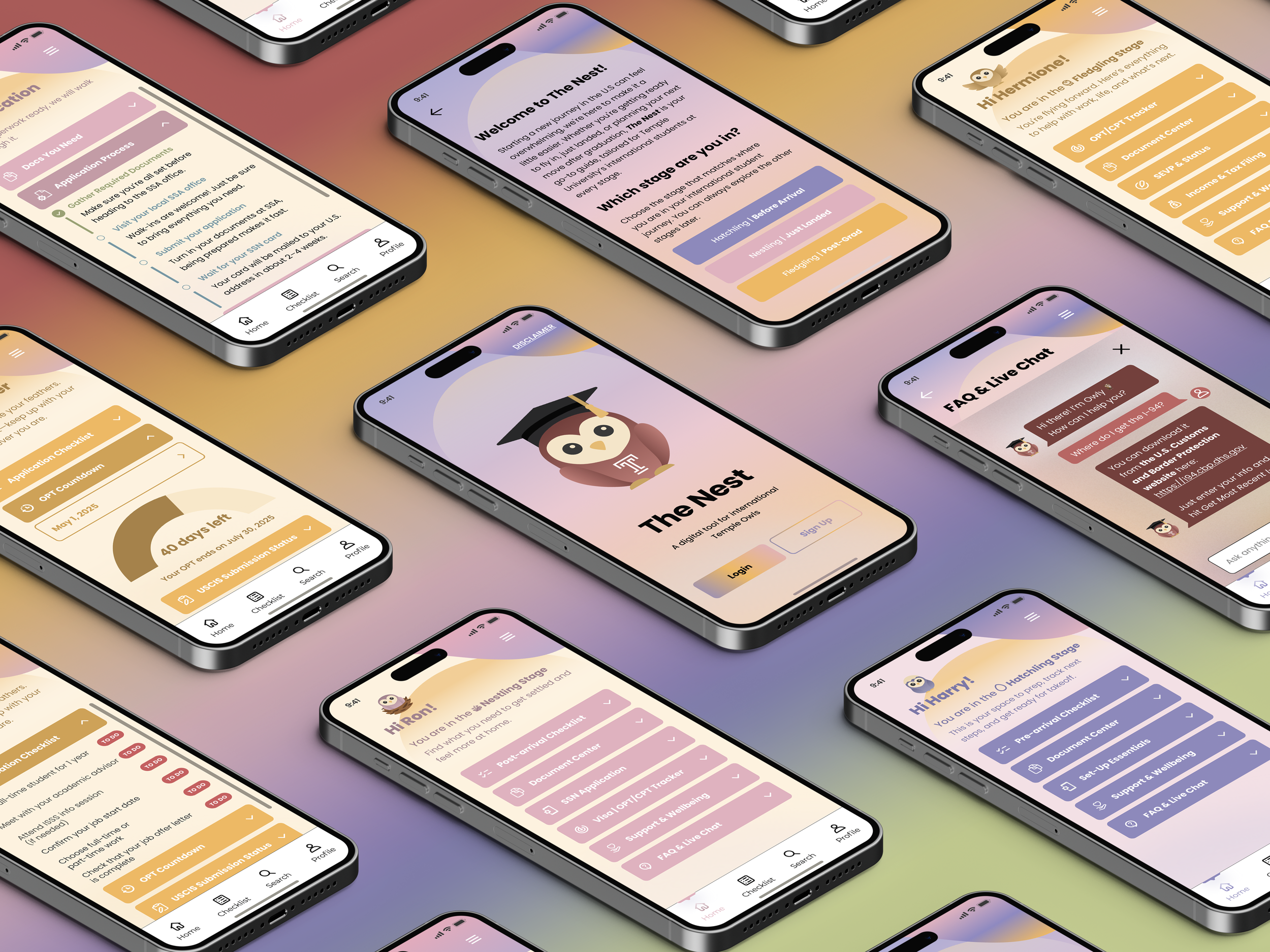
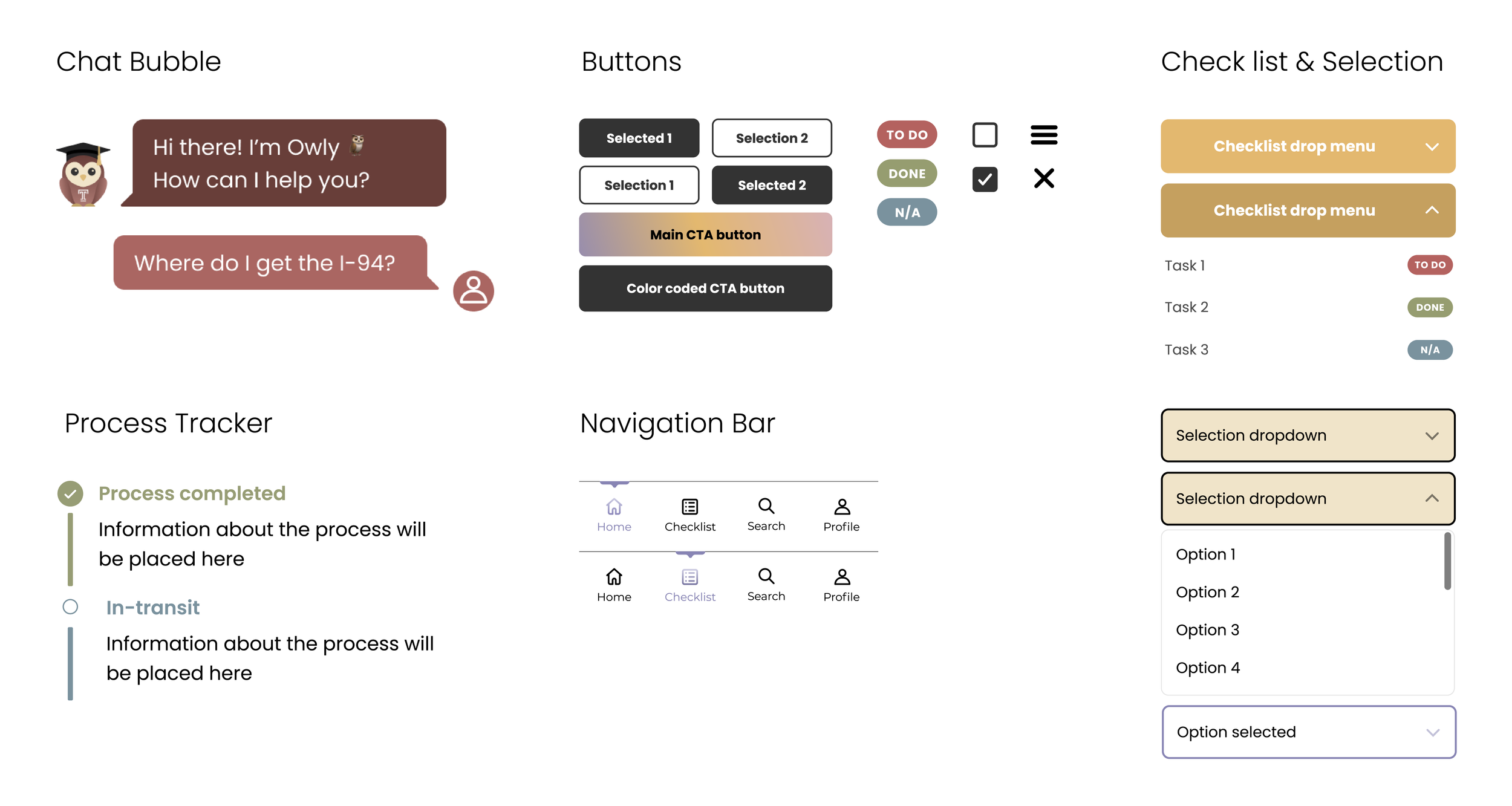
The final result is a high-fidelity Figma prototype designed for mobile use. It includes onboarding, personalized resource access, and support features built into one system that changes with the student’s stage. More than anything, the project asks what happens when support is shaped around lived timing instead of institutional structure. What if information felt less like a checklist handed over all at once, and more like guidance that arrives when it can actually be used.
What I Learned
❋
What I Learned ❋
What stayed with me most from this project is that designing for community asks for real listening. It asks for paying attention to how people describe their own experience, even when what they need seems small or obvious from the outside. Organizing information by stage sounds simple, but it changed the tone of the whole system. It made the experience feel more respectful. It made support feel closer to real life. Student voices shaped the strongest decisions in the project, and that reminder matters to me. Clarity is not just visual. Tone is not just decoration. Both shape whether something feels usable, trustworthy, and worth returning to.
This project was made possible by the international students who participated in the survey.
Instruction by and special thanks to Kelly Holohan
@ Tyler School of Art and Architecture, Temple University